7 Signs Your MyChart Presence Needs an Urgent Makeover
In modern healthcare, the patient journey no longer ends when a patient walks out of the exam room. Increasingly, care happens digitally, with the patient portal acting as the primary hub for communication, test results, and appointment scheduling. For millions of patients and hundreds of healthcare systems, Epic’s MyChart is that digital front door. However, many medical practices treat their portal as a "set-and-forget" utility rather than a dynamic extension of their brand and care philosophy.

If patients find your portal frustrating, difficult to navigate, or outdated, it directly impacts patient satisfaction scores, operational efficiency, and even health outcomes. When engagement drops, staff spend more time on the phone answering routine questions that the portal should handle seamlessly. Evaluating whether your patient-facing digital experience is falling short is the first step toward reclaiming operational efficiency. Here are 7 signs your MyChart presence needs an urgent makeover.
1. Low Patient Activation and Adoption Rates
The most glaring sign of a portal problem is simple: nobody is using it. If your active user percentage is stagnating well below industry averages, your patients are failing to see the value in logging on. Low activation rates usually stem from a cumbersome initial sign-up process, lack of staff promotion at the front desk, or interface confusion.
When onboarding feels like a bureaucratic hurdle rather than a helpful tool, patients simply revert to calling the clinic. To reverse this, look at how your clinic staff introduces the app during check-in. Pair staff enthusiasm with automated, friendly welcome emails that clearly outline the benefits—such as viewing lab results faster or messaging providers directly.
2. A Disjointed Brand Identity
When a patient leaves your custom-designed, beautifully branded website and logs into MyChart, do they feel like they stepped into an entirely different universe? Out-of-the-box portal configurations often feature generic styling that clashes starkly with your practice's visual identity.
A disjointed digital experience erodes patient trust. While you must operate within Epic’s framework, you can still customize login screens, welcome banners, and notification templates to feature your logo, brand colors, and welcoming tone of voice. Consistency builds confidence, reassuring patients they are communicating securely with their trusted care team.
3. High Volume of Routine Phone Calls
Look at your front desk metrics. Are your receptionists constantly bogged down by phone calls asking for appointment times, prescription refills, or basic lab result interpretations? If so, your portal is failing to do its job.
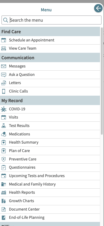
A well-optimized MyChart presence acts as a deflection tool for routine administrative tasks. If patients aren't using the portal for these actions, it usually means the features are buried beneath confusing menus or broken workflows. Conduct a user audit to ensure that scheduling buttons, medication renewal requests, and billing links are front and center on the main dashboard.
4. Cluttered Layout and Poor Mobile Responsiveness
Video: MyChart Tutorial
The majority of your patients are accessing healthcare tools via their smartphones. If your portal layout requires excessive pinching, zooming, or scrolling just to find a message thread, frustration sets in immediately.
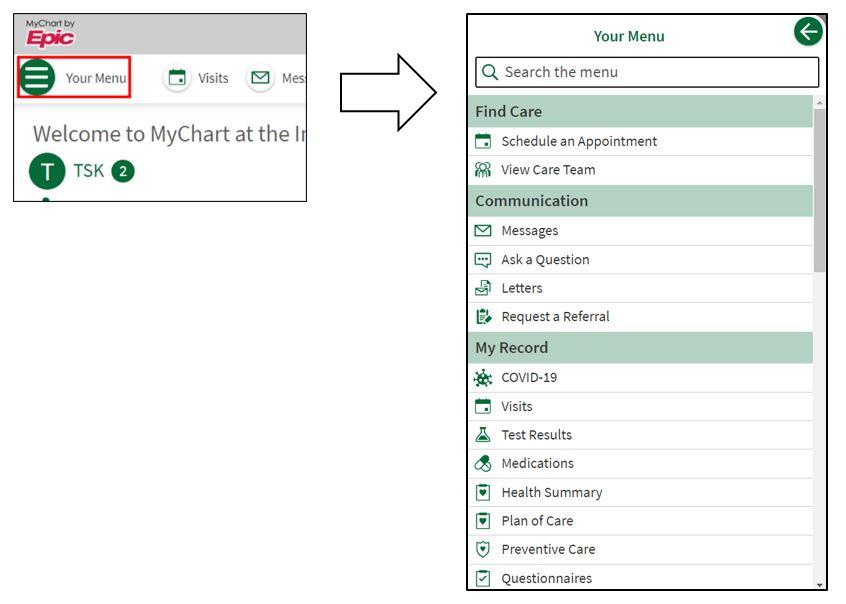
Cluttered text, microscopic buttons, and buried navigation paths drive users away. Your MyChart interface must prioritize mobile-first design principles:
- Prominent, thumb-friendly call-to-action buttons for messaging and scheduling.
- Simplified dashboards that highlight upcoming appointments and unread messages immediately.
- High-contrast text and accessible fonts that cater to elderly or visually impaired patients.
5. Outdated or Inconsistent Messaging Content
Have you updated your portal's welcome instructions, automated responses, or FAQ sections since the pandemic? Outdated information is a major friction point for users looking for clear guidance on billing policies, telehealth availability, or parking instructions.
When patients encounter stale instructions or conflicting guidelines between your main website and your portal, they lose patience. Treat your portal content with the same editorial care as your public-facing website. Regularly review all automated triggers, push notifications, and static informational pages to ensure accuracy.
6. Rising Patient Frustration and Negative Feedback
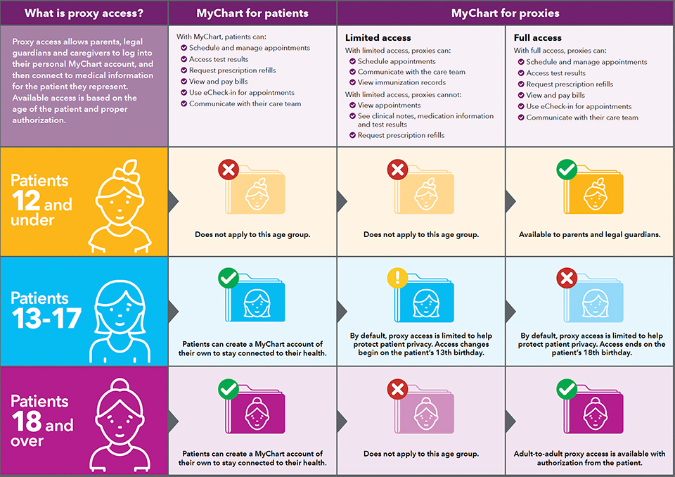
Listen to your frontline staff and online reviews. Are patients frequently complaining about ignored messages, confusing billing interfaces, or difficulty accessing their kids' proxy accounts? Patient complaints are essentially free user-experience research.
If you notice recurring themes in patient grievances regarding the digital experience, treat them as high-priority bugs. Establish a feedback loop where administrative staff can easily report portal usability issues to the marketing or IT teams for swift remediation.
7. Zero Integration with Modern Digital Health Tools
Healthcare consumers today expect seamless interoperability. If your portal functions in a complete silo—disconnected from wearable health data, modern online bill-pay gateways, or automated pre-visit check-in forms—it feels ancient compared to the consumer apps they use every day.
Modernizing your digital presence means leveraging available extensions that streamline patient intake, integrate Apple Health data, or provide transparent, consumer-friendly billing estimates. When the portal makes healthcare easier rather than more bureaucratic, patients embrace it enthusiastically.
Conclusion
Your patient portal is often the digital front door to your practice, influencing how patients perceive your quality of care before they even step into an exam room. Recognizing these warning signs allows you to transition your patient portal from a bureaucratic chore into a powerful tool for engagement, efficiency, and growth. By investing time into redesigning your digital workflows, refining your branding, and prioritizing mobile usability, you create a smoother experience for patients and a less stressed staff.