A Beginner's Guide to Understanding Color Complementary Opposites
Introduction to Color Theory
Color is one of the most powerful tools in design, art, and communication. It evokes emotions, directs the eye, and establishes mood without a single word being spoken. However, working with color can feel overwhelming without a solid foundational system. This is where the color wheel comes in, serving as a roadmap for visual harmony.
Among the various relationships on the color wheel, one stands out for its ability to create striking visual impact: A Beginner's Guide to Understanding Color Complementary Opposites breaks down how these dynamic pairs interact. When you understand how opposite colors work together, you unlock the ability to make your creative projects pop with intentional balance and contrast.
What Are Complementary Colors?
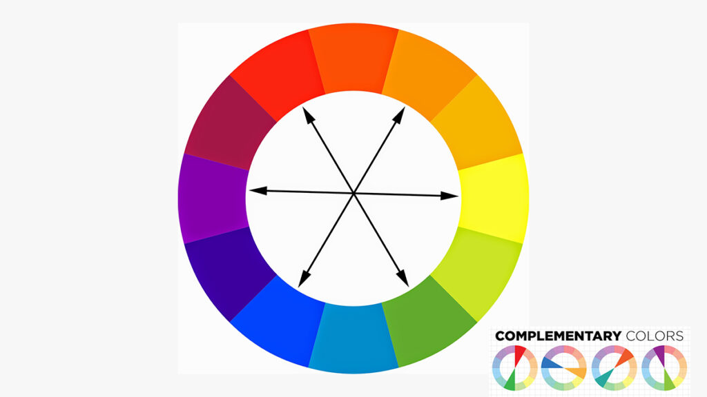
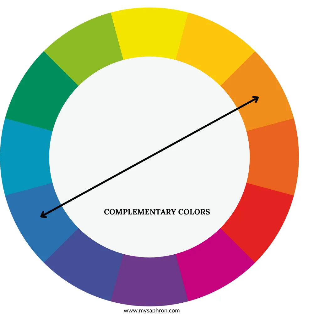
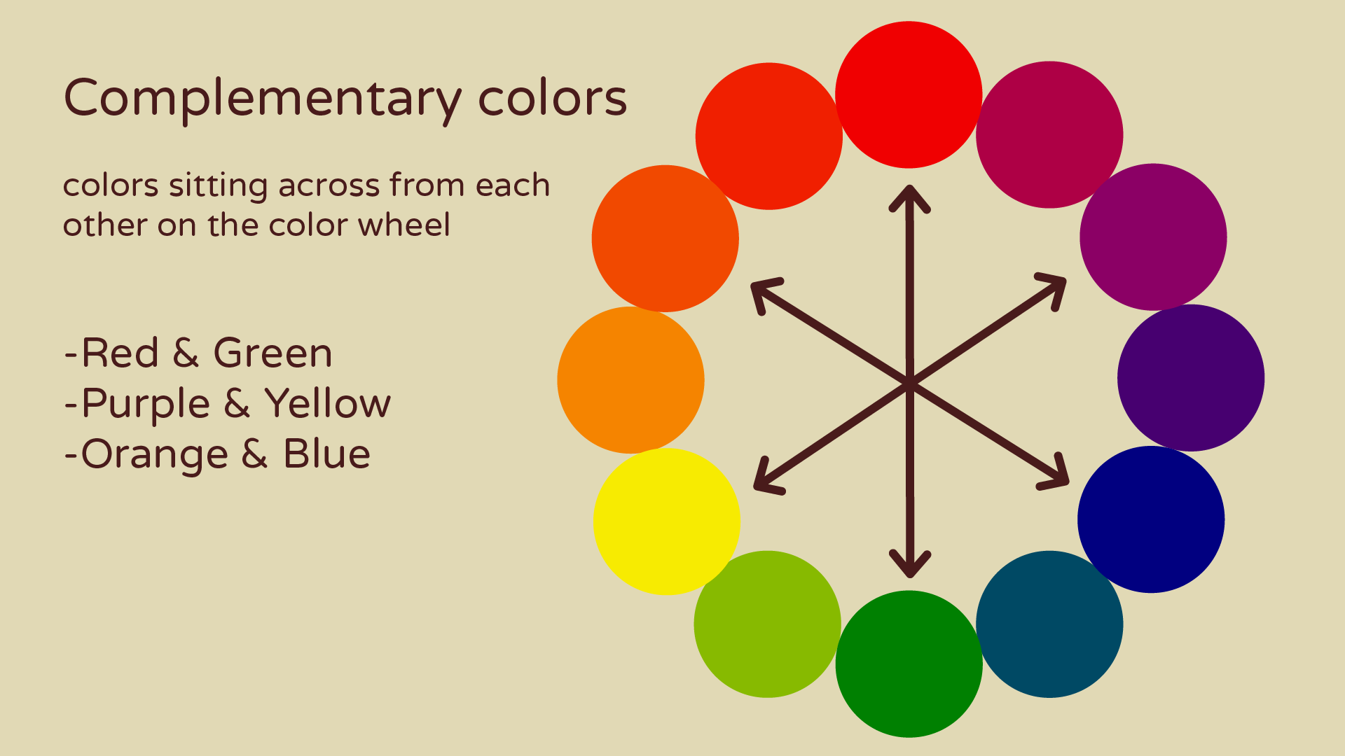
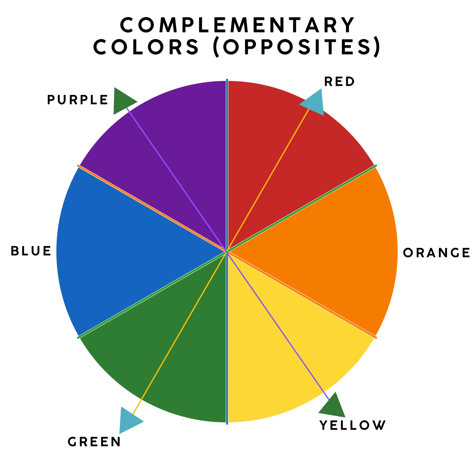
Complementary colors are pairs of colors that sit directly opposite each other on the standard color wheel. When placed side by side, they create maximum contrast because they share no common undertones. This stark difference makes each color appear more vibrant than it would next to a neutral or an analogous hue.
To visualize this, imagine standing in the center of a traditional 12-part color wheel:
- If you look at red, the color directly across from it is green.
- If you look at blue, its direct opposite is orange.
- If you look at yellow, its direct counterpart is purple (or violet).
These pairings form the backbone of traditional color theory. They are used everywhere, from sports team uniforms and corporate logos to famous oil paintings and interior home design.
The Science Behind Visual Opposites
The relationship between complementary colors is not just an arbitrary artistic rule; it is rooted in human biology and the physics of light. Light travels in waves of varying lengths, and human retinas contain specialized light-sensitive cells called cones that process these wavelengths as red, green, and blue.
When you stare at a bright patch of a single color for an extended period, those specific cones become fatigued. If you suddenly look away at a blank white wall, your eyes will temporarily project the opposite color—known as an afterimage. For example, staring at a bright red square will cause your fatigued red cones to rest, leaving the green-processing cones to fire, resulting in a faint green ghost image.
Artists and designers leverage this biological phenomenon. When placed next to each other, complementary opposites trick the eye into seeing both hues with heightened intensity, creating a vibrating optical energy.
Exploring the Primary Pairs
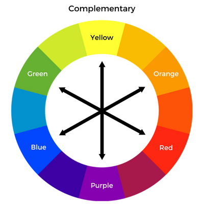
While the color wheel expands into tertiary hues, every beginner should master the three primary complementary pairs derived from the RYB (Red, Yellow, Blue) color model used in traditional art.
Red and Green
Red and green represent the ultimate high-contrast pair. Because of their strong association with the winter holidays, using them together requires a delicate touch unless you specifically want a festive theme. Designers often mute one or both colors—such as pairing a deep burgundy with a subtle sage green—to create sophisticated, earthy palettes that avoid looking like a holiday card.
Blue and Orange
Blue and orange are arguably the most versatile and widely used complementary pair in modern media. Because blue sits on the cool end of the spectrum and orange on the warm end, they create an immediate temperature contrast that the human eye naturally loves. This pairing is heavily favored in Hollywood film color grading, where actors' skin tones (which contain orange undertones) pop dramatically against cool blue cinematic backgrounds.
Yellow and Purple
Yellow and purple offer a regal, high-contrast combination. Yellow is the lightest and most luminous color on the wheel, while purple is deep and heavy. This dynamic makes yellow and purple fantastic for designs that need to capture immediate attention, though balancing their visual weight requires careful proportioning so that the bright yellow does not completely overpower the dark purple.
Practical Applications in Design and Art
Knowing the theory is only half the battle; applying it effectively takes practice. Here are a few practical ways to use complementary opposites in your own creative work:
- Create Focal Points: If an entire design is washed in cool blue tones, introduce a single splash of bright orange to draw the viewer's eye directly to your primary call-to-action or subject matter.
- Tone Down Intensity: Pure complementary colors can be visually exhausting if used at full saturation. Mix a color with a small amount of its complement to naturally desaturate it and create rich, complex neutral tones rather than reaching for black or gray.
- Enhance Readability: Ensure high contrast for text and background elements by utilizing opposing hues, keeping accessibility and color blindness in mind.
Conclusion
Mastering color complementary opposites is a rite of passage for any artist, designer, or creative hobbyist. By understanding how opposite hues interact on the color wheel, you gain total control over the mood, balance, and focus of your projects. Start experimenting with simple red-green or blue-orange pairings today, and watch how intentional contrast transforms your creative work.