Avoid RGB Color Conversion Mistakes in Web Design
Color is one of the most critical elements of digital product design, yet it remains one of the most misunderstood. When building digital interfaces, designers and developers routinely move between color models—flipping hex codes into RGB, exporting print swatches to the browser, or shifting legacy palettes into modern CSS color spaces. However, if you do not actively avoid common mistakes in RGB color conversion for web design, your brand colors can quickly turn muddy, transparency can misbehave, and user accessibility may suffer.

While standard RGB (Red, Green, Blue) has been the backbone of web graphics for decades, modern web design demands tighter precision. Between high-density wide-gamut displays, updated CSS Color Level 4 specifications, and strict accessibility standards, simple manual color conversions are no longer risk-free. Below, we break down the most frequent conversion pitfalls and how to resolve them.
Understanding How the Web Handles RGB
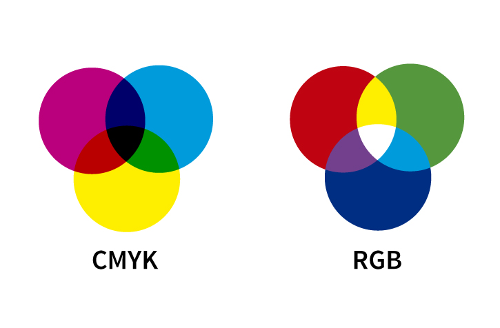
In web browsers, the standard RGB color model represents colors as additive mixtures of red, green, and blue light. Each channel traditionally uses 8 bits of data, giving values from 0 to 255, which yields approximately 16.7 million possible colors.
Web browsers have historically interpreted standard RGB values within the sRGB color space. Whether you define your color as a hexadecimal string (#1A73E8), an rgb() functional notation (rgb(26, 115, 232)), or an hsl() rule, the browser maps those values into sRGB pixels on the screen. Problems arise when assets created in different environments—such as print suites, photography profiles, or wide-gamut monitors—are translated into web-ready RGB without accounting for how color spaces and numerical representations interact.
How to Avoid Common Mistakes in RGB Color Conversion for Web Design
Whether you are automating design tokens or manually translating palette values, watch out for these five critical conversion errors.
1. Confusing Alpha Channel Notations (Hex vs. Functional RGB)
One of the most frequent syntax bugs in CSS occurs when developers translate transparent hex codes into rgba() or modern space-separated rgb() notations.
In an 8-digit hex code like #00000080, the last two digits represent transparency on a base-16 scale from 00 (0) to FF (255). Here, 80 in hexadecimal equals 128 in decimal, which is roughly 50% opacity.
However, when converting this value to CSS functional notation, developers frequently make two mistakes:
- Entering integer opacity above 1: Writing
rgba(0, 0, 0, 50)thinking 50 represents 50%. In CSS, values above1.0clamp to1.0(fully opaque), meaning the intended transparency is completely lost. - Imprecise percentage rounding: Manually converting
#80to0.5instead of0.502(128 ÷ 255). While a tiny difference in isolation, compounding these rounding errors across nested UI overlays leads to mismatched visual states.
Modern CSS syntax simplifies this: use rgb(0 0 0 / 50%). Using explicit percentages eliminates the confusion between 0–1 floats and 0–255 integer channels.
2. Relying on Direct CMYK-to-RGB Arithmetic
Brand style guides frequently supply CMYK formulas meant for commercial offset printing alongside RGB hex codes. A common mistake is using generic online conversion formulas (such as R = 255 × (1 - C) × (1 - K)) to calculate the RGB equivalents.
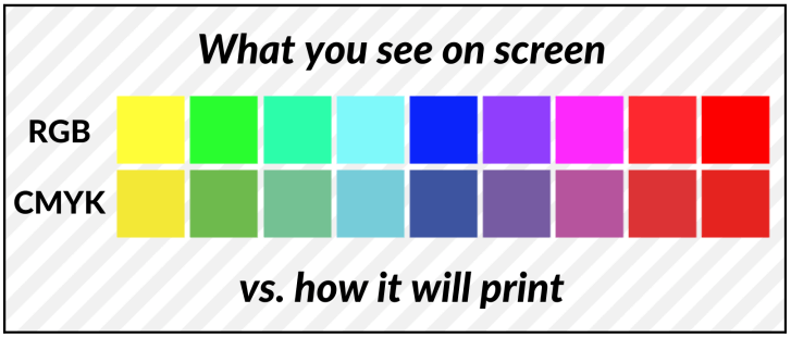
CMYK is a subtractive ink model governed by physical printing processes, paper absorbency, and specific ink sets (like SWOP or GRACoL). The mathematical conversion between CMYK and RGB is not linear. When you use naive mathematical formulas instead of profile-aware color management (ICC profiles), bright brand colors—especially saturated greens, deep blues, and vibrant oranges—shift into dull, muddy approximations on screen.

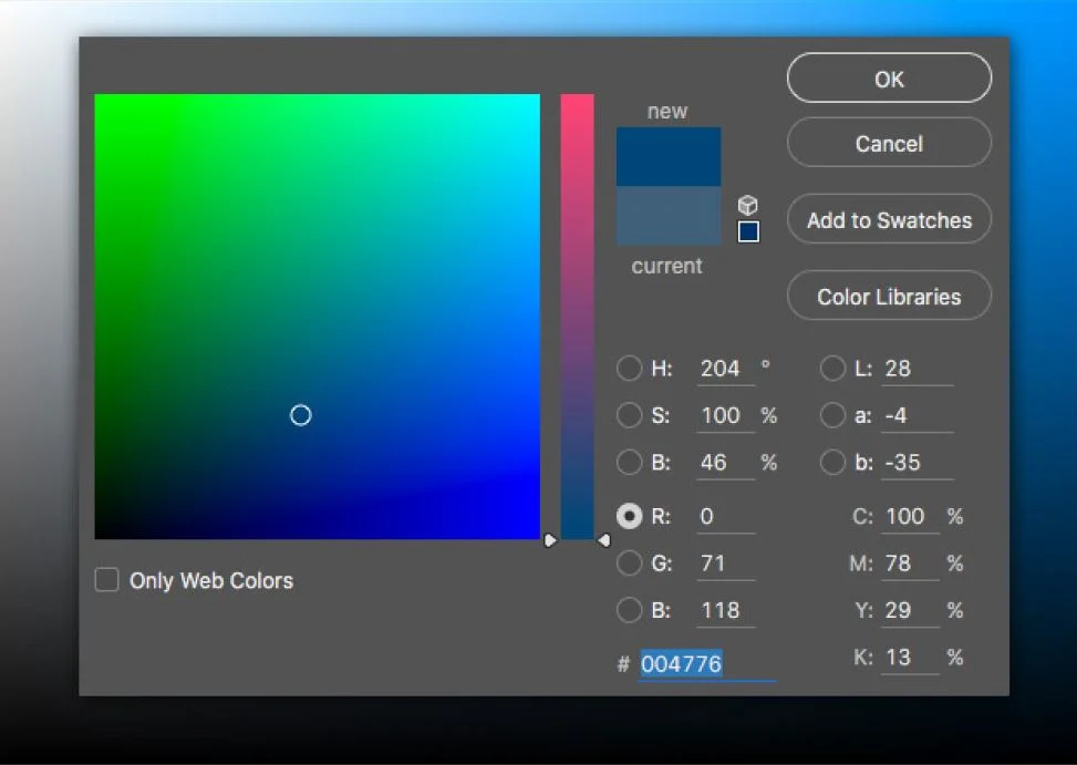
The Fix: Always convert print palettes to RGB within color-managed software like Adobe Photoshop, Illustrator, or Affinity Designer using an assigned color profile (such as converting from your specific CMYK profile to sRGB IEC61966-2.1) rather than relying on raw web calculators.
3. Ignoring Wide-Gamut Displays (sRGB vs. Display P3)
Most modern smartphones, laptops, and tablets now feature screens capable of displaying the Display P3 color gamut, which is roughly 25% larger than standard sRGB. A vibrant neon green or deep crimson rendered in Display P3 cannot be represented accurately within standard 8-bit sRGB.
When you convert a P3 color directly down to standard RGB via simple clipping, the browser forces the out-of-gamut color to the nearest edge of the sRGB boundary. This causes gamut clipping, which flattens highlights, ruins gradients, and causes banding in vibrant images and UI elements.
To preserve high-end display fidelity while maintaining fallbacks for standard monitors, leverage CSS Color Module Level 4:
/* Fallback for standard displays */
.button-vibrant {
  background-color: rgb(0, 200, 115);
}

/* High-chroma color for wide-gamut screens */
@supports (color: color(display-p3 0 1 0)) {
  .button-vibrant {
    background-color: color(display-p3 0.15 0.78 0.45);
  }
}
4. Blending and Interpolating in Non-Linear sRGB
Standard RGB is not perceptually uniform. In sRGB, numbers are encoded using a non-linear gamma curve to compensate for how human vision perceives brightness. When you create a CSS gradient between two complementary colors (for example, pure blue rgb(0, 0, 255) and pure yellow rgb(255, 255, 0)), naive interpolation calculates the midpoint in gamma-encoded sRGB space.
The result is a visually jarring, desaturated "dead zone"—often a muddy gray or dull olive brown—in the center of the gradient. Designers often assume this is an error with their chosen RGB colors, but it is actually an interpolation failure.
The Fix: Specify perceptually uniform color spaces like OKLab or OKLCH for color transitions and mixing:
/* Avoids the muddy midpoint in gradients */
.hero-gradient {
  background: linear-gradient(in oklab to right, #0000ff, #ffff00);
}
5. Breaking Accessibility Ratios Post-Conversion
Design teams often verify accessibility in Figma using hex codes, only to find the live product fails Web Content Accessibility Guidelines (WCAG) contrast minimums (such as 4.5:1 for body text). This frequently happens due to two conversion-related issues:
- Quantization & Rounding: Converting an HSL lightness value like
hsl(210, 50%, 60.4%)into an 8-bit RGB integer introduces slight rounding discrepancies that can dip contrast ratios right below compliance thresholds. - Alpha Compositing: Using semi-transparent RGB values (e.g.,
rgba(0, 0, 0, 0.6)) over variable backgrounds rather than defining solid RGB values. If the background changes slightly, the contrast ratio shifts unpredictably.
Best Practices for Modern Web Color Workflows
To ensure high fidelity, consistent rendering, and maintainable style sheets across your digital products, adopt these three habits:
- Standardize on CSS Color Level 4: Adopt space-separated RGB syntax (
rgb(255 255 255 / 80%)) and explore modern formats likeoklch()for programmatic palette generation. - Audit Colors in the Browser: Never rely solely on design tool exports. Use Chrome or Firefox DevTools' built-in color pickers, which can visualize gamut boundaries and display real-time contrast ratios against underlying DOM elements.
- Centralize Design Tokens: Define primary colors once in standard sRGB, alongside explicit wide-gamut definitions, and distribute them across your team using shared CSS variables or Figma tokens.
Final Thoughts
Color conversion in web design is no longer just a matter of changing #HEX to rgb(). By understanding gamut boundaries, using correct transparency syntax, and leveraging modern CSS interpolation spaces, you can eliminate muddy palettes, preserve brand integrity, and deliver crisp, accessible visuals to every visitor regardless of their screen technology.