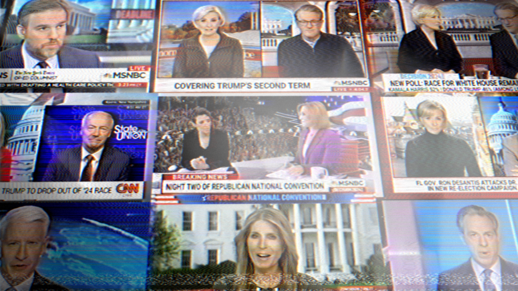
Cable.News Header Design: UX Best Practices
When visitors land on a major broadcast or digital journalism platform, the very first touchpoint is the masthead. Building and optimizing an effective cable.news header requires balancing fast-paced editorial updates, live broadcast feeds, and intuitive site navigation without sacrificing load speed or user experience. For media organizations, the header is not merely a branding element; it is an active command center that directs attention, signals urgency, and drives digital engagement.

Unlike standard corporate websites or blogs, digital newsrooms handle unpredictable information flows. A routine news cycle can shift into a breaking global event in seconds. Your header architecture must be flexible enough to reflect that transition seamlessly while maintaining accessibility, structural hierarchy, and ad monetization paths.
The Anatomy of a Modern News Masthead
A high-performance news header generally operates on a layered, modular layout. Rather than cramming every link and feature into a single bar, modern news portals use a two- or three-tier system to organize content by priority.
1. The Utility Tier
Located at the very top, this secondary bar manages operational details and personalized user data without distracting from editorial coverage. Common elements include:
- Edition Switchers: Toggles for region-specific content (e.g., US, International, Español).
- Timestamps and Market Tickers: Live indicators of financial indices (Dow, S&P 500) and localized weather.
- Account and Subscription Triggers: Quick access to sign-in modals, member dashboards, and premium paywall conversion funnels.
2. The Primary Brand & Navigation Tier
This is the core visual anchor. It houses the primary publication logo, main category verticals (Politics, Opinion, Business, Tech, Culture), and the search interface. For broadcast-first networks, this tier prominently features a high-visibility "Watch Live" or "Listen Live" button that leads users straight to the streaming player.
3. The Breaking News & Alert Bar
The digital equivalent of the broadcast lower-third chyron, this dynamic strip appears directly beneath the primary navigation. It alerts users to fast-moving stories and ongoing special coverage. When dormant, it can either collapse entirely or display curated trending topics.
Core Components of a Modern Cable.News Header
Designing a resilient cable.news header means anticipating multiple operational states. Editorial teams need controls to toggle between low-friction everyday layouts and high-intensity alert modes without engineering intervention.
Dynamic Breaking News States
Editorial urgency should dictate the visual weight of the header. A robust design system establishes distinct tiers of urgency:
- Standard Notification: Subtle background, dark gray or neutral blue, used for developing enterprise stories or general site announcements.
- Breaking News: Bold high-contrast banner (often yellow, amber, or deep red) featuring a prominent "BREAKING" badge and a concise, single-line headline.
- Critical Event / Red Alert: A site-wide takeover mode used during catastrophic events, elections, or major global summits. In this state, the alert bar may expand to include a persistent embedded mini-player or multi-angle live blog feed.
Sticky Navigation and Scroll-Depth Behavior

News readers frequently consume long-form reportage, analysis, and multi-paragraph live updates. To retain engagement as readers scroll, the header must adapt gracefully:
- Smart Shrink: The utility bar drops out of the viewport on scroll, leaving only a slim, compact version of the primary navigation and the live stream link.
- Reading Progress Indicators: Some news platforms integrate a thin progress line along the bottom border of the sticky header to visually show reading completion.
- Scroll-Direction Visibility: To maximize reading screen real estate on mobile devices, modern headers often hide on scroll-down and reappear immediately on scroll-up.
Technical Performance: Speed, Layout Shift, and Accessibility
High-traffic media sites cannot afford technical debt in their mastheads. A poorly built header degrades Core Web Vitals, alienates users on slow mobile networks, and harms organic search rankings.
Preventing Cumulative Layout Shift (CLS)
One of the most persistent issues in media web design is layout jumping caused by asynchronously loaded breaking news bars, live audio players, and banner advertisements. If your breaking news API returns an alert 800 milliseconds after page load and shifts the main article body downward, your CLS score will plummet.
To mitigate this:
- Reserve Container Space: Allocate fixed min-height attributes for utility bars or use CSS transforms (overlays) rather than pushing the document flow downward.
- Use CSS
contain-intrinsic-size: For modular components loaded via client-side rendering, maintain consistent sizing profiles. - Prioritize Critical CSS: Inlining critical styles for the masthead ensures the top of the page paints instantly while external scripts load asynchronously.
Screen Reader Accessibility (a11y)
Breaking news bars present unique accessibility challenges. Dynamic content injections must be announced to assistive technologies without overwhelming the listener.
- Use
aria-live="polite"for standard breaking news updates so the screen reader finishes its current task before announcing the headline. - Reserve
aria-live="assertive"strictly for life-safety or national emergency alerts. - Ensure keyboard navigation (Tab/Shift+Tab) smoothly traverses the primary verticals, search toggle, and account links in a logical DOM order.
- Include a hidden "Skip to Main Content" link as the very first focusable element in the DOM.
Mobile Optimization: The Hamburger Menu vs. Horizontal Scroll
Over 70% of news traffic originates on mobile devices. Desktop layouts with eight to ten primary navigation links cannot simply shrink down. Designing a mobile header requires calculated trade-offs:
| Approach | Pros | Cons |
|---|---|---|
| Off-Canvas / Hamburger Menu | Clean aesthetic; accommodates hundreds of subcategories, podcasts, and archives. | Hides content discovery behind an extra tap; lower click-through rates on minor verticals. |
| Horizontal Category Scroll | High discoverability; users can swipe through Politics, Tech, and Markets quickly. | Can hide overflow links off-screen; requires clear visual fade cues at screen edges. |
| Hybrid Model | Keeps 3-4 top categories visible alongside an "All Sections" menu drawer. | Requires tight CSS management and strict priority hierarchies. |
UX Lessons from Tier-1 Digital Newsrooms
Top-tier networks—including CNN, Fox News, MSNBC, and the BBC—demonstrate how refined mastheads drive business objectives. When evaluating their implementations, three patterns stand out:
- Streamlined Direct-to-Consumer Funnels: Digital cable channels increasingly push proprietary streaming subscriptions. Notice how "Live TV" or "Watch Now" elements utilize distinct accent colors (such as vibrant red or high-vis cyan) to pull the eye away from editorial text.
- Contextual Sub-Navigation: During major events (such as election nights or the Olympics), leading platforms replace secondary navigation links with dedicated event dashboards, medal trackers, or live map links.
- Lightweight Ad Integration: Header leaderboard ads (typically 728x90 or 970x250) are isolated within dedicated wrappers above the navigation. This prevents third-party ad script delays from blocking navigation rendering.
Conclusion: Treating the Header as an Editorial Engine
An optimized news header does far more than display a logo and a handful of links. It is an operational engine that reacts to world events, supports high-speed content delivery, and routes audiences deeper into your digital publication. By focusing on modularity, predictable layout performance, and clear breaking news hierarchy, engineering and design teams can create an intuitive, lightning-fast header that commands authority from the very first pixel.