Church Bulletins That Drive Engagement and Action
Why Traditional Bulletins Fail to Engage

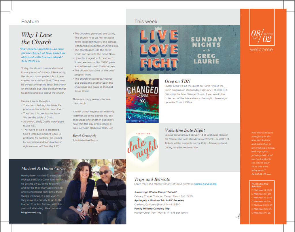
For decades, the standard church bulletin has been a folded piece of cardstock filled with dense paragraphs, black-and-white clip art, and a rigid order of service. Unfortunately, most of these traditional handouts end up crumpled at the bottom of a purse, left in the pews, or immediately recycled in the lobby. When church leaders treat the bulletin merely as an administrative checklist rather than a communication tool, they miss a vital opportunity to connect with their congregation.
Today's churchgoers are accustomed to clean digital interfaces, clear typography, and concise messaging. When handed a wall of text, their eyes glaze over. To combat this, communication teams must rethink their strategy and intentionally design church bulletins that drive engagement and action. By shifting the focus from simply reporting information to inviting participation, your printed or digital handout becomes a dynamic bridge between Sunday morning and daily discipleship.
Shift From Information Dumping to Invitation
The primary flaw in most church print materials is information overload. Every ministry leader wants space for their specific event, leading to a cramped page where nothing stands out. If everything is emphasized, nothing is emphasized.
The Rule of Three for Announcements
Limit your primary print announcements to three major calls to action per week. Trying to promote ten different events at once guarantees that people will remember zero. Choose the most critical initiatives—such as an upcoming community service day, a new small group semester, or a foundational membership class—and give them room to breathe.
- Clear Headline: State the event or opportunity plainly.
- The "Why": Briefly explain how this initiative benefits the individual or the community.
- Single Next Step: Provide one specific action, such as scanning a QR code or visiting a specific web address.
Modern Design Principles for Better Readability
Good design is not just about making things look pretty; it is about reducing cognitive load. When a reader can scan your bulletin in fifteen seconds, they are far more likely to absorb the core message.
Whitespace is Your Friend
Do not fear empty space. Leaving margins, spacing out paragraphs, and separating sections with clean lines allows the reader's eye to rest. Cluttered layouts signal stress and confusion, while clean layouts signal clarity and calm.
Typography and Hierarchy
Stick to a maximum of two font families—one for headings and one for body text. Use varying font weights (bold, regular, light) and sizes to create a natural visual hierarchy. A reader should instantly know what is most important based on the size and placement of the text.
Leveraging Digital Integration
The physical bulletin should never try to compete with the internet; instead, it should act as a gateway to it. Space on a page is limited, but the digital ecosystem is infinite.
Strategic Use of QR Codes
QR codes have moved from a novelty to an expectation. Instead of printing long, complicated URLs for event registrations or giving tithes, use a dynamic QR code. Place it next to a compelling call to action like, "Scan to register your child for Vacation Bible School." This removes friction, allowing a congregant sitting in the pew to complete an action in real time using their smartphone.
Digital-First Options
Consider offering a digital companion to your printed piece. Many modern churches utilize app-based bulletins or mobile-friendly web pages. This approach not only saves paper and printing costs but also allows you to update information dynamically throughout the week if event times or locations change.
Measuring the Effectiveness of Your Bulletin
How do you know if your communication efforts are working? You have to measure the results. If you change how you design your handouts, track the metrics that matter.
- QR Code Scans: Track how many people interact with digital links via the printed page using trackable short links or dedicated landing pages.
- Event Attendance: Monitor whether sign-ups increase for events highlighted using the new, simplified bulletin format.
- Congregational Feedback: Periodically survey your congregation or ask a focus group of newcomers if they find the weekly handout easy to read and helpful.
Conclusion
Your church bulletin is often the first tangible piece of your ministry that a guest interacts with, and it remains a weekly touchpoint for your regular attenders. By moving away from cluttered information dumps and embracing intentional design, clear calls to action, and smart digital integration, you can create church bulletins that drive engagement and action. Start small by trimming your announcements this week, and watch how a cleaner, more focused approach transforms passive attendees into active, engaged participants.