Color Rosas: A Guide to Mastering Your Palette
Rose tones are among the most versatile, psychologically complex shades in the entire color spectrum. Often reduced to mere romance or delicacy, “color rosas”—encompassing everything from desaturated blush and warm dusty cedar to electric magenta and deep antique rose—carries immense structural power in visual design. Whether you are building a modern brand identity, painting a canvas, or designing a living space, unlocking the secrets of color rosas: a guide to mastering your palette will help you harness these nuanced hues with confidence and precision.

The Spectrum of Color Rosas: From Petal to Pigment
To master rose tones, you must first recognize that “color rosas” is not a single swatch, but an entire family of colors balanced along the red, magenta, and orange spectrum. Understanding where each variation sits helps you avoid unintended clashes and choose the right emotional register for your project.
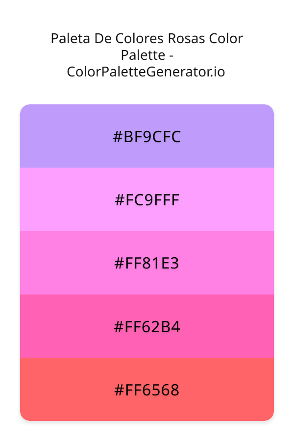
- Soft and Powdery Rosas: Shades like blush, pale petal, and dusty rose sit close to neutral territory. With high lightness values and lowered saturation, these tones function almost like tinted off-whites or warm greys, offering subtlety without drawing excessive attention.
- Warm, Earth-Leaning Rosas: Tones such as terracotta rose, coral blush, and desert rose contain significant yellow or brown undercurrents. They evoke warmth, clay, and sunbaked stone, making them grounded rather than juvenile.
- Saturated, High-Chroma Rosas: Hues like French rose, fuchsia rose, and bright cerise demand immediate focus. They radiate optimism, high energy, and modernity when used deliberately as accents.
- Deep and Moody Rosas: Plum-rose, antique marsala, and carmine rose blend red with deep violet, blue, or black. They introduce luxury, weight, and dramatic contrast to a composition.
Understanding Undertones: Warm vs. Cool Rosas
The primary reason a rose palette fails is an unaddressed clash in undertones. Like all red derivatives, rose can lean noticeably warm or cool depending on the secondary pigments present.
Cool Rose Undertones
Cool rosas contain blue or violet bias. Examples include mauve, tea rose, and berry-tinted rose. In digital spaces, these shades often feature an RGB profile where the blue channel significantly outweighs the green channel. In physical paint mixing, they are achieved using cool pigments such as Quinacridone Magenta or Permanent Rose. Cool rose palettes convey sophistication, calmness, and quiet luxury. They pair effortlessly with crisp cool grays, slate, charcoal, and emerald greens.
Warm Rose Undertones
Warm rosas lean toward yellow, gold, or orange. Examples include salmon rose, peach blush, and desert clay. In these tones, the red base is modified with touches of yellow ochre, raw sienna, or cadmium orange. Warm rosas feel welcoming, organic, and energetic. They harmonize seamlessly with olive greens, warm linen whites, deep chocolate browns, and brass or gold metallic accents.
Unlocking the Secrets of Color Rosas: A Guide to Mastering Your Palette
Building a successful palette around rose tones requires balancing contrast, saturation, and proportion. Rather than relying on trial and error, professional designers utilize systematic color strategies to achieve cohesion.
- Establish the Dominant Temperature: Decide upfront whether your hero rose is warm or cool. Do not pair a cool, bluish mauve directly alongside a warm, peachy salmon unless you deliberately insert a strong neutral buffer between them.
- Apply the 60-30-10 Distribution Rule: A balanced color scheme rarely divides hues equally. Dedicate 60% of your visual field to a foundational neutral (such as bone white, taupe, or dark charcoal), 30% to a mid-tone rose, and 10% to a high-contrast accent (such as forest green or deep copper).
- Control Saturation Carefully: High-saturation rosas can quickly overwhelm an audience. If your primary rose hue is vibrant, drop the saturation of your secondary colors to keep the visual hierarchy clear and readable.
- Verify Luminance Contrast: In graphic and web design, ensure that text placed against rose backgrounds meets accessibility standards (a minimum contrast ratio of 4.5:1 for standard text under WCAG guidelines). Dusty rose backgrounds frequently fail readability tests when paired with white text; dark espresso or charcoal typography solves this problem immediately.
4 Curated Palette Formulas Using Rose Tones
Here are four tested color combinations featuring color rosas across various aesthetic styles, ready to deploy in branding, interiors, or illustration:
1. The Earthy Botanical Palette (Complementary)
This palette uses the natural tension between red and green, softened into organic, earthy variations:
- Base: Muted Olive Green (#556B2F)
- Supporting: Dusty Rose (#DCAE96)
- Accent: Warm Alabaster (#F8F4EE)
Where to use it: Sustainable lifestyle branding, kitchen cabinetry, and editorial print layouts.
2. The Modern Monochrome (Analogous Depth)

Layering multiple values of the same hue creates a rich, tonal atmosphere without visual clutter:
- Deep Tone: Plum Rose (#5E2C3D)
- Mid Tone: Antique Mauve (#A46877)
- Light Tone: Pale Petal (#F3E5E8)
Where to use it: Luxury packaging, cosmetics marketing, and hospitality interiors.
3. The Urban Architectural Palette (High Contrast)
Rose tones add an unexpected human element to rigid, industrial neutrals:
- Dark Base: Slate Charcoal (#2B2D42)
- Hero Color: Vibrant Coral Rose (#E26D5C)
- Neutral Buffer: Light Concrete Gray (#D8DBE2)
Where to use it: Tech dashboards, modern architectural facades, and activewear branding.
4. The Warm Sunset Minimalist (Tonal Harmony)
A comforting, tactile palette that emphasizes warmth and natural light:
- Base: Sand Dune (#E6D5C3)
- Supporting: Terracotta Rose (#C07264)
- Accent: Burnished Gold (#C99E32)
Where to use it: Hospitality branding, living room color blocking, and ceramics studios.
Applying Color Rosas Across Disciplines
Interior Design and Lighting
In physical spaces, rose tones interact dramatically with natural light. A dusty rose wall in a north-facing room (which receives cool, blue-tinted daylight) can look dull and gray if it lacks warm undertones. For north-facing spaces, choose a rose with a peach or yellow base. In south-facing rooms with warm, abundant light, cool blush or mauve tones prevent the room from feeling overly heated.
Digital Product and UI Design
In user interface design, rose hues are increasingly replacing aggressive pure reds for warnings, tags, and highlights when a softer, friendlier aesthetic is desired. Muted rose backgrounds provide a calm backdrop for reading apps and modern wellness platforms, provided you maintain sufficient contrast with primary UI elements.
Fine Art and Pigment Mixing
Traditional painters often struggle with muddy rose mixes when blending standard red and white. To achieve clean, luminous color rosas on canvas, bypass cadmium reds, which turn chalky when cut with titanium white. Instead, mix single-pigment Quinacridone Rose (PV19) or Quinacridone Magenta (PR122) with a warm white like zinc-titanium blend, adjusting warmth with minute touches of Raw Sienna.
Transform Your Creative Work with Intentional Rose Tones
Mastering color rosas comes down to intentionality. By identifying undertones, balancing saturation, and pairing your chosen rose with complementary or grounding neutral shades, you elevate rose from a decorative novelty into an expressive, professional design asset. Test your values, mind your light source, and build palettes that communicate clear mood and purpose.