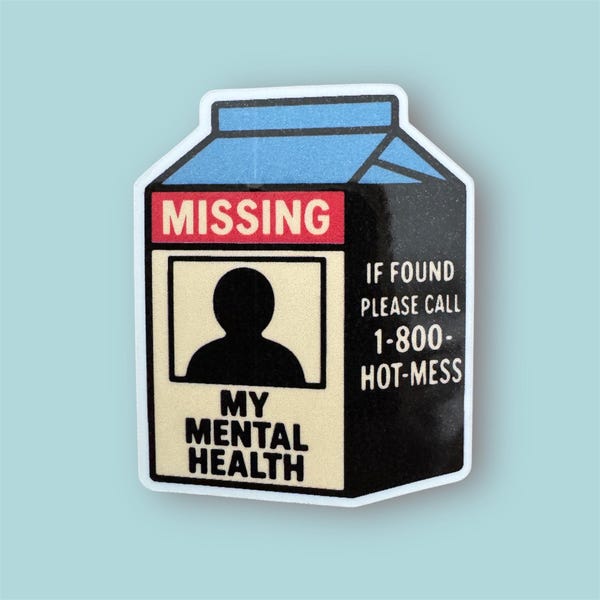
Create Effective Missing Person Milk Carton Posters
In the mid-1980s, the United States saw one of the most recognizable public awareness initiatives in modern history: printing photos of missing children directly onto milk cartons. While the original program phased out as digital databases like the Amber Alert system took over, the format remains an iconic visual symbol of community vigilance. Whether you are designing an awareness initiative, a period-accurate film prop, an art installation, or a retro-style community flyer, learning how to create effective missing person milk carton posters requires a firm grasp of visual hierarchy, readability, and emotional clarity.

Designing for a milk carton presents unique spatial challenges. You are working with a tall, narrow, vertical canvas that consumers typically view up close and under varying light conditions. Every millimeter of space must serve a distinct purpose.
The Essential Anatomy of a Milk Carton Notice
A successful notice balances urgency with clear, digestible information. Milk cartons were traditionally viewed during breakfast, meaning the design had only seconds to make an impression before a reader looked away. To replicate this efficiency, every layout must feature five core components:
- The Header Banner: A bold, unmistakable alert—typically the word "MISSING" in high-contrast lettering.
- The Primary Portrait: A clean, uncluttered, forward-facing photograph.
- Identifying Vitals: Structured bullet points detailing age, height, weight, hair color, and eye color.
- Contextual Summary: A brief 2–3 sentence overview detailing where and when the person was last seen.
- Actionable Contact Information: Direct contact numbers for investigating law enforcement agencies or verified tip lines.
Best Practices to Create Effective Missing Person Milk Carton Posters
Because cartons have limited panel widths—traditionally between 2.75 inches (half-pint) and 3.75 inches (half-gallon)—you cannot rely on standard poster layouts. Follow these strategic design steps to maximize visibility and clarity.
1. Optimize the Photography for Low-DPI Substrates
Historically, milk cartons were printed on waxy paperboard using flexographic printing techniques, which frequently resulted in dot gain and reduced contrast. If you are printing physically onto cartons, choose a headshot with high tonal separation.
Avoid busy backgrounds. Crop tightly around the subject's face, neck, and shoulders. If the subject has been missing for an extended period, displaying a split image with a certified age-progressed rendering alongside the last confirmed photograph can dramatically increase the likelihood of accurate recognition.
2. Prioritize Strict Typography and Hierarchy
Vertical panels tempt designers to shrink text to fit everything in. Resist this urge. Cluttered text repels the eye. Instead, follow a disciplined typographical hierarchy:

- Primary Alert (24–36pt Bold): Use a clean, sans-serif or condensed block typeface (such as Futura Bold, Impact, or Helvetica Compressed) for the top banner.
- Subject Name (16–20pt Bold): Clearly legible beneath the photograph.
- Descriptive Data (9–11pt Medium): Use a highly readable typeface with open counters, such as Arial, Roboto, or Univers. Avoid decorative scripts or ultra-thin weights that disappear at small sizes.
3. Emphasize Distinguishing Physical Marks
General statistics (like average height and weight) help narrow down possibilities, but unique identifiers trigger immediate recognition. Make room for specific, immutable details:
- Birthmarks, facial scars, or notable dental traits (e.g., braces, chipped teeth).
- Prominent tattoos or piercings, noting specific locations on the body.
- Prescription eyewear styles or medical conditions that alter gait or speech.
- Clothing and accessories worn when last seen.
4. Keep the Call to Action Unambiguous
The bottom panel must tell the reader exactly what to do. Never include ambiguous contact info. State clearly: "If you have any information, call [Agency Name] immediately at [Phone Number]." If creating a functional contemporary poster, consider adding a high-contrast QR code at the bottom. This allows readers to scan and instantly access secure tip portals, high-definition digital galleries, or live case updates.
Common Layout Pitfalls to Avoid
Even well-intentioned notices fail when poor design choices obscure crucial information. Keep these common missteps in mind during the proofing stage:
- Poor Contrast: Black text on a dark gray or red background is unreadable in dim kitchen or grocery store lighting. Stick to solid black text on a clean white background.
- Unverified Contact Lines: Never publish personal cell phone numbers or social media handles for active cases. This exposes families to harassment and clogs investigative channels. Use official tip lines or designated investigative divisions only.
- Full-Justified Text Blocks: Fully justifying short lines of text creates "rivers of white space" that disorient the reader. Use clean, left-aligned text for paragraphs and bulleted lists for vital stats.
- Overcrowding the Margins: Cartons require folding, sealing, and gluing along the seams. Keep all text and critical image components at least 0.25 inches (6mm) away from outer edges and score lines.
Technical Specifications for Carton Mockups and Prints
If you are producing physical packaging—whether for a brand awareness campaign or a period film set—adhere to standard packaging guidelines:
- Color Mode: Work strictly in CMYK. Vintage milk carton designs often utilized a two-color spot process (typically Black and Process Blue or Warm Red) to minimize production costs. Replicating this 2-color approach adds authentic period character while maintaining sharp edges.
- Resolution: Set your artwork raster assets to a minimum of 300 DPI at actual size. Even if the printing process is coarse, starting with high-resolution source files prevents unwanted pixelation.
- Bleed and Crease Lines: Download a standard gable-top carton dieline before laying out artwork. Ensure your headline does not cross into the top sloped crease where the carton folds inward.
Summary: Design with Purpose and Precision
The milk carton poster format remains an enduring cultural touchstone because of its unpretentious, direct utility. By prioritizing high-contrast headshots, clean sans-serif typography, structured physical attributes, and an unmistakable call to action, you can create a layout that commands attention and conveys critical information in a matter of seconds.