Elegant Music Symbol Coloring Designs to Try
Coloring has evolved far beyond a casual childhood pastime into a respected mindful practice for artists and hobbyists alike. When combined with the universal language of sound, coloring offers a uniquely meditative experience. If you are looking for creative inspiration that balances visual grace with rhythmic harmony, there are several elegant music symbol coloring designs to try on your next creative afternoon.

Musical notation inherently possesses visual balance. The sweeping contour of a clef, the sharp geometry of an accidental, and the fluid motion of tied notes all lend themselves to artistic reimagining. Whether you use colored pencils, gel pens, or alcohol markers, these sophisticated design concepts will elevate your coloring session into an artistic study of melody and form.
The Aesthetic Appeal of Musical Notation
Composers and engravers have spent centuries perfecting the visual proportions of sheet music. Standard music notation is designed for instant legibility, but its underlying structure relies on classical principles of balance, weight, and curvature.
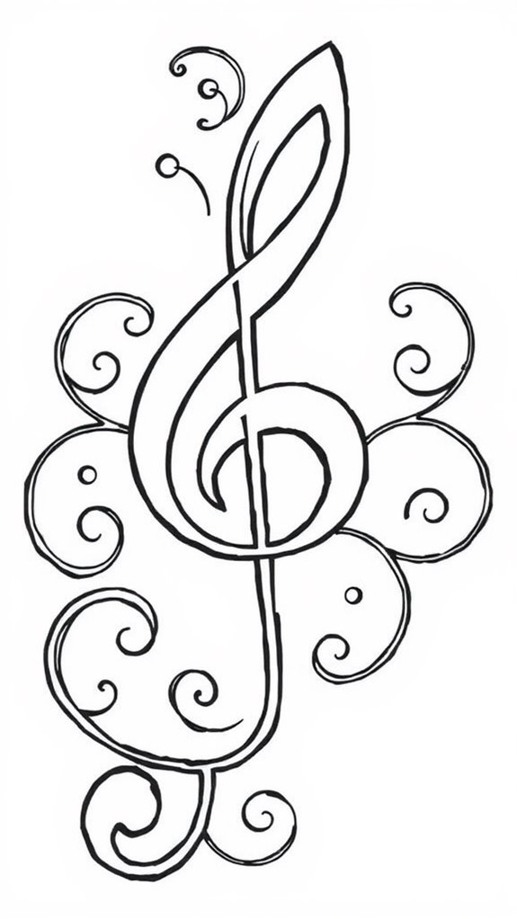
When transformed into coloring pages, musical symbols provide natural focal points. A single treble clef offers both expansive open spaces and tight interior loops, inviting artists to experiment with smooth gradients, intricate fill patterns, or high-contrast shading. The contrast between solid note heads and delicate stems establishes a natural rhythmic cadence across the page.
Top Elegant Music Symbol Coloring Designs to Try
Rather than settling for plain, cartoonish representations of notes, explore concepts that treat notation as fine decorative art. Here are six distinct design directions that offer both complexity and visual sophistication.
1. The Botanical Treble Clef
One of the most graceful musical illustrations weaves the G-clef with living foliage. In this design, the vertical spine of the clef transforms into a woody vine or climbing rose branch. Delicate tendrils curl off the crossbars, and blooming peonies or jasmine blossoms cluster at the base loop.
- Coloring Tip: Use deep forest greens and olive tones for the central stem, allowing soft blush pinks or cream whites on the flower petals to provide gentle contrast against the dark linework.
2. The Celestial Bass Clef
The gentle curve of the bass (F) clef mirrors the shape of a crescent moon. Sophisticated designs frequently embrace this connection by turning the clef into a lunar sliver surrounded by stardust, with the two pitch-indicating dots drawn as glowing orbital bodies or twin stars.
- Coloring Tip: Blend rich indigo, violet, and midnight black in the background using heavy colored pencils or soft pastels. Leave the crescent clef brilliant white or fill it with shimmering metallic silver gel pen.
3. Cascading Ribbon Staffs
Instead of rigid, parallel horizontal lines, this concept renders the five-line staff as a winding silk ribbon floating through empty space. Tied eighth notes, sixteenth-note runs, and expressive fermatas drift along the undulating ribbon like leaves carried by an autumn breeze.
- Coloring Tip: Treat the ribbon with dynamic shading. Darken the undersides of the folds with charcoal or slate gray to give the staff three-dimensional depth, making the floating notes appear suspended above the paper.
4. Mandala-Infused Note Beams
Video: 🤩 This Artwork Changes Color Every Time You Look at It! ✨🎨

For colorists who enjoy meditative geometric patterns, mandala arrangements built entirely from musical symbols offer endless variety. These illustrations radiate outward from a central cluster of overlapping whole notes, using eighth-note beams, accidentals (sharps, flats, naturals), and coda signs to create mesmerizing radial symmetry.
- Coloring Tip: Select a constrained color palette of three to four complementary shades (such as teal, copper, and mustard yellow) to keep the intricate geometry cohesive and prevent visual clutter.
5. The Zen Rest and Fermata Sanctuary
In music, silence is just as critical as sound. Designs featuring quarter rests, eighth rests, and fermatas (the symbol for an indefinite hold) carry an inherent sense of stillness. Look for minimalist layouts where a stylized rest sits within Japanese wave patterns, zen stones, or delicate ink-wash rings.
- Coloring Tip: Lean into negative space. Resist the urge to fill every white area; instead, use subtle shading around the symbol's perimeter to emphasize tranquility and breath.
6. Vintage Baroque Filigree Notes
Drawing inspiration from 17th-century harpsichords and illuminated manuscripts, this style fills oversized note heads and sweeping beams with ornate acanthus leaves, scrollwork, and French rococo filigree. The symbols themselves resemble antique cast-iron ironwork or gilded architectural reliefs.
- Coloring Tip: Apply metallic gold, bronze, or brass tones with burnished brown edges to simulate antique metalwork, paired with a rich jewel-toned backdrop like deep emerald or burgundy.
Refined Color Palettes for Musical Pages
The colors you choose dramatically influence whether a page feels playful or refined. To achieve an elegant, display-worthy finish, consider stepping away from standard rainbow fills and testing one of these curated palettes:
- The Conservatory Library: Mahogany brown, aged parchment amber, dark forest green, and accents of muted antique gold. This palette creates an academic, historical atmosphere suited for complex vintage designs.
- Midnight Nocturne: Cobalt blue, deep violet, smoky charcoal, and pure titanium white highlights. Excellent for designs that feature flowing melodies and celestial themes.
- Minimalist Monochrome: Grayscale tones ranging from warm 20% gray to deep carbon black, punctuated by a single vibrant accent color—such as crimson or bright turquoise—on a lone focal note.
- Ethereal Pastel: Soft lavender, dusty rose, sage green, and pale buttercup yellow. Ideal for botanical clefs and floral musical arrangements.
Techniques to Add Depth to Musical Line Art
Once you select a design, applying a few foundational coloring techniques will elevate the finished piece from flat line art to a dimensional illustration.
Burnishing for a Lacquered Finish: Musical instruments and formal notations often have smooth, glossy textures. After applying your base pencil layers, use a colorless blender pencil or a very light cream pencil with heavy pressure to melt the wax layers together. This eliminates paper grain and produces a sleek, reflective sheen reminiscent of a polished grand piano.
Strategic Cast Shadows: Even simple designs gain dramatic presence with consistent drop shadows. Decide on a single light source (for example, the upper left corner). Using a soft cool gray pencil, lightly shade along the lower and right-hand borders of clef stems, note heads, and bar lines. This small adjustment makes the notation appear to lift off the background.
White Gel Pen Highlights: Fine-point white gel pens are indispensable for musical coloring pages. Use them to trace delicate reflections along the curved spine of a clef, restore lost line separations within dense filigree, or dot tiny starlight clusters across a dark background.
Transforming Your Finished Pages
Because these musical compositions prioritize elegance, completed pages look striking outside the coloring book. Trim your finished page cleanly, mount it inside a beveled white mat, and set it in a simple black or metallic frame. Displayed in an entryway, near a piano, or inside a home office, your hand-colored musical study serves as both personal art and a thoughtful tribute to the beauty of sound.