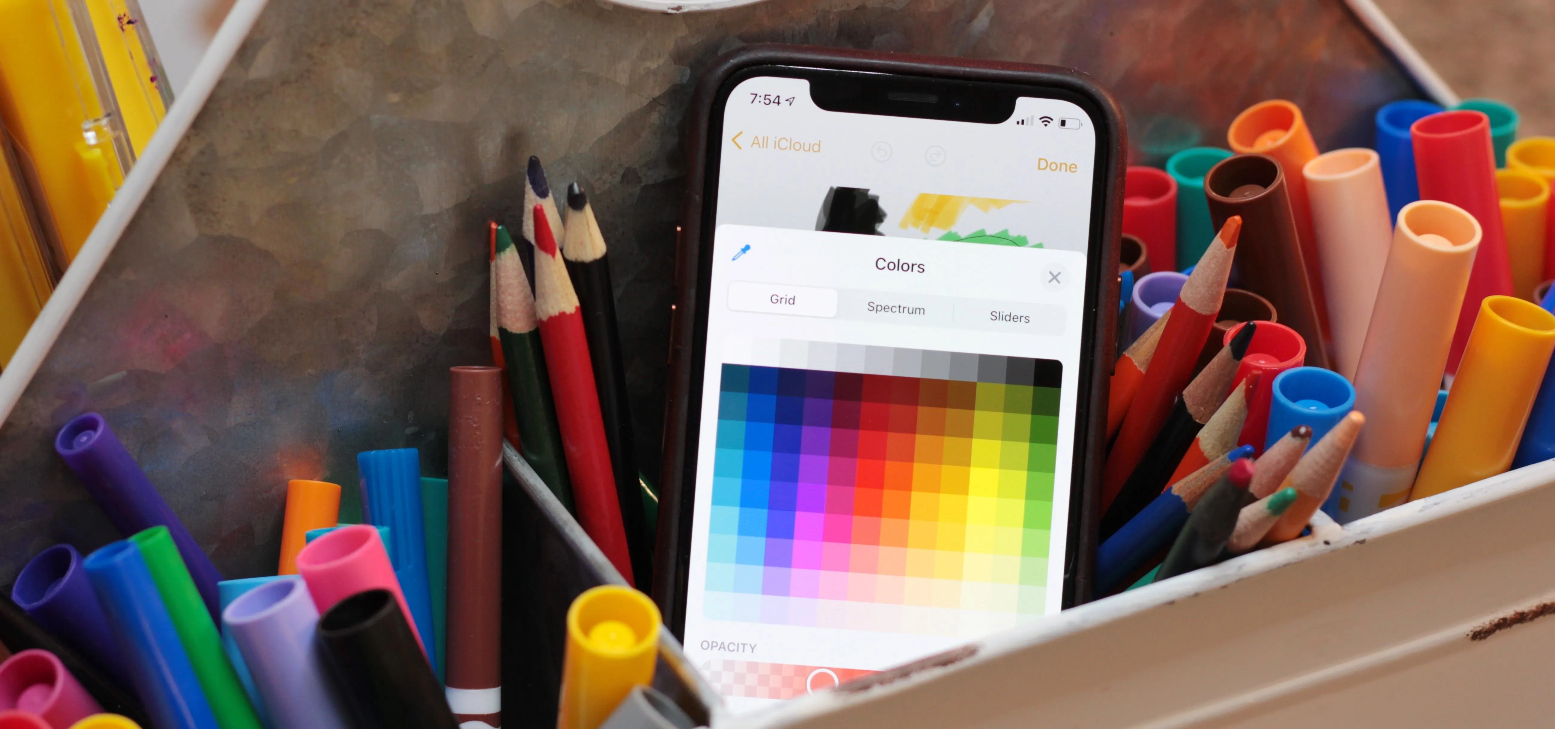
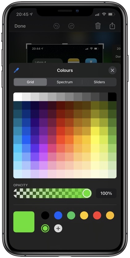
Elevate App Visuals: Advanced iOS Color Picker Techniques
Color is one of the most powerful communication tools in modern interface design. Whether you are building a digital illustration suite, a photo editor, a dashboard theme customizer, or a personal productivity tool, providing an intuitive, expressive way for users to select colors is critical. To truly elevate your app's visuals with advanced iOS color picker techniques, you must look beyond basic out-of-the-box controls and harness the full fidelity of Apple's display hardware, color spaces, and native APIs.

Modern iOS releases provide powerful primitives through both UIKit and SwiftUI. However, crafting a seamless experience requires understanding color spaces like Display P3, managing continuous user input without dropping frames, supporting alpha transparency gracefully, and persisting color palettes reliably. This guide explores the architectural patterns and technical details required to turn simple color selection into a standout feature of your app.
Elevate Your App's Visuals with Advanced iOS Color Picker Techniques
At the center of Apple's modern color selection toolkit sits UIColorPickerViewController in UIKit and the native ColorPicker view in SwiftUI. While many developers implement these components with default configurations, taking full control of their behavior unlocks a much higher standard of visual polish.
By tailoring properties such as continuous color updates, alpha channel visibility, and custom modal presentations, you can adapt standard controls to feel native to your specific application context. Understanding when and how to intercept color selections allows you to implement live canvas previews, responsive haptics, and undo-redo state stacks that professional users expect.
Configuring Native Color Pickers for Maximum Control
When using UIKit, UIColorPickerViewController offers delegate methods that differentiate between intermediate adjustments and finalized selections. Handling this distinction is essential for compute-heavy tasks:
- Continuous Selection (
colorPickerViewController(_:didSelect:continuously:)): Triggers as the user drags their finger across the color wheel, spectrum, or sliders. Use this callback for lightweight UI updates, such as updating a preview stroke or modifying a tint color. - Finalized Selection (
colorPickerViewControllerDidFinish(_:)): Fires when the user dismisses the picker. Defer expensive operations here, such as re-rendering high-resolution textures, updating Core Data models, or syncing to cloud databases. - Alpha Channel Toggling: Set
supportsAlpha = falsewhen designing for contexts where transparency would cause rendering artifacts, contrast failures, or unsupported export formats (such as JPEG-only pipelines).
In SwiftUI, the ColorPicker view provides a declarative binding to a Color or CGColor instance. By setting supportsOpacity: false, you can cleanly disable alpha sliders when opacity is unneeded, simplifying the interface and avoiding user confusion.
Mastering Wide-Gamut Display P3 Color
Apple displays on iPhone, iPad, and Mac hardware have long supported the Display P3 wide-gamut color space. Standard sRGB represents only a fraction of the colors that human eyes can perceive and modern OLED and Retina screens can render. Vibrant neon greens, deep crimson reds, and intense electric blues are clipped when restricted to sRGB.
To deliver striking visuals, your color picker pipeline should preserve Display P3 color definitions from selection to rendering:
- Preserve the Native Color Space: Avoid naively reading
UIColor.redComponent,greenComponent, andblueComponent, which often implicitly clamp colors into standard sRGB. Instead, inspect the underlyingCGColorSpaceof the selected color. - Conversion Safety: When transforming between SwiftUI
Color, UIKitUIColor, and Core GraphicsCGColor, ensure you maintain the original color profile. Convert explicitly usingcolor.cgColor.converted(to: CGColorSpace(name: CGColorSpace.displayP3)!, intent: .defaultIntent, options: nil)when working with image processing pipelines. - Asset Catalog Coordination: If your app supplies preset swatches alongside the picker, author them in Asset Catalogs with the Display P3 gamut option selected to match the dynamic range of user-picked colors.
Building Persistent Custom Palettes and Recents
Video: How to Make a Color Picker with ScrollView, Scroll Position and Visual Effects - SwiftUI iOS 17
A frequent shortcoming in production apps is losing the user's custom color history between sessions. While the system color picker maintains its own internal palette, users benefit significantly when your application surfaces contextual swatches, document-specific palettes, and brand guidelines directly alongside the picker interface.
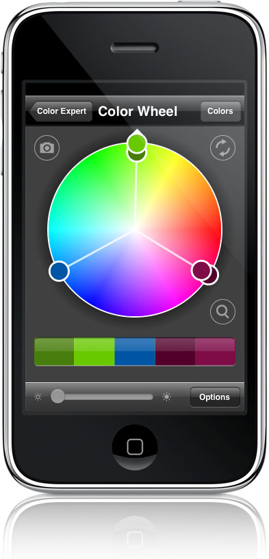
Robust Serialization of Color Data
Storing colors directly as hex codes (e.g., #FF0055) is common, but traditional 6-digit hex representations fail to capture wide-gamut P3 coordinates and alpha channels accurately. To avoid color shifting across app launches, implement a robust encoding strategy:
- Codable Color Wrappers: Create a lightweight struct that stores component values (Red, Green, Blue, Alpha) alongside an identifier for the color space (sRGB, Display P3, or Extended sRGB).
- Hex with Color Space Tags: If your backend requires web-compatible string formats, store colors using modern CSS Color Module Level 4 syntax, such as
color(display-p3 0.95 0.12 0.35 / 0.8), rather than legacy hex strings. - Secure Archiving: For local persistence in SwiftData or Core Data, archive the
UIColorobject viaNSKeyedArchiverwith secure coding enabled to maintain full fidelity without custom parsing code.
Integrating Eyedropper Sampling and Custom Canvas Pickers
The native iOS color picker includes a built-in eyedropper tool, which lets users sample any pixel visible on their screen. While the system handles this automatically when the picker view controller is active, creative apps often require continuous sampling directly on an in-app canvas or custom camera view.
To implement high-performance, custom in-canvas color sampling:
- Use Metal or Core Graphics for Pixel Extraction: Avoid using
UIView.drawHierarchy(in:afterScreenUpdates:)repeatedly during drag gestures, as it introduces severe main-thread latency. Instead, sample raw pixel data directly from your underlying image buffer or Metal texture. - Add Magnification Feedback: Pair sampling gestures with a floating loupe (magnifier view) that displays an enlarged grid of pixels surrounding the touch point, along with an indicator showing the active color in real time.
- Integrate Tactical Haptic Feedback: Use
UISelectionFeedbackGeneratororUIImpactFeedbackGenerator(style: .light)as the user moves across distinct high-contrast color boundaries on the canvas. Subtle tactile cues make digital picking feel physical and precise.
Ensuring Accessibility and Contrast Compliance
Providing advanced color customization brings the responsibility of maintaining readable, accessible interfaces. When users apply their picked colors to text, buttons, or critical iconography, your app should proactively prevent illegible combinations.
Calculate the relative luminance of user-selected colors using the WCAG 2.1 formula. If a user selects a light yellow background for a card containing white text, dynamically adapt the foreground element to a dark charcoal, or display an inline warning indicator informing the user of low contrast.
Additionally, ensure your color picker triggers appropriate accessibility notifications. VoiceOver should speak both the name of the color (using the system's localized color descriptions) and its accessibility role, ensuring users with visual impairments are not excluded from creative customization.
Summary of Best Practices
Upgrading your color selection workflow elevates the visual and tactile standard of your entire iOS application. Keep these core principles at the forefront of your implementation:
- Distinguish between continuous updates and finished events to safeguard main-thread performance.
- Embrace Display P3 color spaces to exploit modern iPhone and iPad hardware capabilities.
- Store serialized colors with their corresponding color space identifiers to prevent unexpected gamut shifts.
- Complement visual selection with responsive haptics, magnification loupes, and accessibility contrast checks.
By treating color selection as an integrated feature rather than an afterthought, you provide users with the creative freedom, precision, and visual depth that define world-class iOS applications.