Make Your I in Bubble Letters Stand Out Instantly
When you are designing custom signage, hand-lettered greeting cards, or graffiti-style locker art, the letter 'I' can sometimes feel a little too simple. Because it is essentially just a straight vertical line, it risks getting lost among curvier, more dynamic characters like 'S,' 'B,' or 'O.' However, with a few clever design tricks, you can easily make your I in bubble letters stand out instantly and serve as a striking focal point in any word.

Mastering bubble letters is all about creating the illusion of 3D volume, playful curves, and clean proportions. In this guide, you will learn step-by-step methods to transform a basic uppercase or lowercase 'I' into a puffed-up masterpiece that grabs attention.
The Anatomy of a Perfect Bubble Letter I
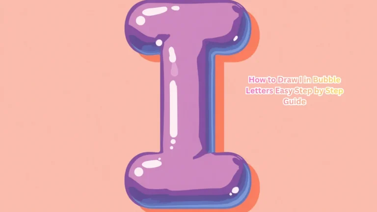
Before adding fancy effects, you need a solid foundation. Even though an 'I' is straight, your bubble version should maintain soft, rounded edges to keep that classic inflated look.
Step-by-Step Basic Outline
- Draw a light, straight vertical guideline in pencil to keep your letter from leaning.
- Sketch a pill shape or a thick rectangle around your guideline, making sure the top and bottom caps are wider and fully rounded.
- Ensure the middle section of the 'I' is slightly pinched in to give it that authentic, squeezed balloon appearance.
- Outline your pencil sketch with a thick, permanent black marker, then erase your guidelines.
How to Make Your I in Bubble Letters Stand Out Instantly
Once you have your basic inflated outline, you can employ several visual techniques to give your letter depth, texture, and personality. Here are the most effective ways to elevate your design:
1. Add Dramatic Drop Shadows
Shadows are the absolute fastest way to lift a flat drawing off the page. Imagine a light source shining from the top-left corner of your paper. This means your shadows will fall consistently on the bottom and right-hand sides of your letter 'I'.
Use a cool gray marker or a soft black pencil to draw a thick offset shadow trailing away from the right and bottom edges. Leave a tiny sliver of white space between the letter and the shadow if you want a retro sticker effect.
2. Incorporate 3D Extrusions
Taking your shadow a step further, a full 3D block extrusion turns your letter into a physical object.
Draw parallel diagonal lines extending outward from all the corners of your bubble 'I'.
Connect the ends of those diagonal lines to mimic the exact shape of your front face.
Video: I’m teaching you the easiest bubble letter alphabet - save this for your next drawing ✨ #tutorial
Color in the side panels with a darker shade of your main color to create immediate contrast.
3. Use High-Contrast Color Blocking
Flat colors can work wonders if you choose the right palette. Instead of coloring the 'I' a single boring shade, split it down the middle.
Paint the left half hot pink and the right half electric blue, or use a vibrant gradient marker set to blend two complementary colors smoothly from top to bottom. High-contrast color choices naturally draw the human eye straight to the center of your composition.
4. Add Glossy Highlights and Shine Lines
Nothing says "bubble" quite like a shiny, reflective surface. You can simulate the look of polished plastic or inflated latex with simple white highlights.
Using a white gel pen or a liquid paint marker, draw two curved, organic crescent shapes along the upper-left edge of your 'I'. Add a small white dot near the middle for an extra sparkle. This instantly tricks the brain into seeing a glossy, rounded 3D form.
Creative Textures and Patterns
If solid colors feel too plain, you can fill the interior of your bubble 'I' with fun patterns. Because the letter 'I' is relatively narrow, stick to patterns that do not overwhelm its shape:
- Polka Dots: Add playful pastel circles floating inside the bubble boundaries.
- Zebra Stripes or Leopard Print: Give your lettering an edgy, wild aesthetic.
- Brick or Stone Texture: Fill the blocky frame of the 'I' with a tiny brick pattern for an urban, industrial vibe.
- Galaxy Swirls: Blend purples, dark blues, and tiny white star specks for a cosmic masterpiece.
Surrounding Your Letter with Supporting Elements
Sometimes making your letter stand out has less to do with the letter itself and more to do with its environment. Give your 'I' some breathing room by framing it effectively.
Add cartoon bubbles, floating stars, or little kinetic energy lines radiating outward from the corners. If your letter is part of a larger word, make the 'I' slightly taller or give it a brighter color scheme than the surrounding letters so it acts as the visual anchor of the design.
Common Mistakes to Avoid
When drawing bubble letters, beginners often fall into a few common traps:
- Inconsistent Width: If the top is massive and the bottom is paper-thin, the letter will look lopsided. Keep your proportions balanced.
- Dirty Eraser Marks: Always let your ink dry completely before erasing your initial pencil lines to prevent smudging.
- Forgetting the Light Source: If you put highlights on the right and shadows on the left, your brain will become confused because the lighting physics won't make sense. Pick one light source and stick to it.
By combining smooth rounded outlines, rich 3D block shading, and glossy white highlights, you can easily make your I in bubble letters stand out instantly on any art project, notebook cover, or digital design.