Master Pike Lettering for Holiday Cards
Few gestures carry the warmth and enduring charm of a handwritten holiday greeting. While loose brush scripts and standard modern calligraphy dominate store-bought stationery, learning distinctive display typography can transform your seasonal mail into keepsake art. If you want to stand out in your recipients' mailboxes this season, it is time to master the art of pike lettering for holiday cards.
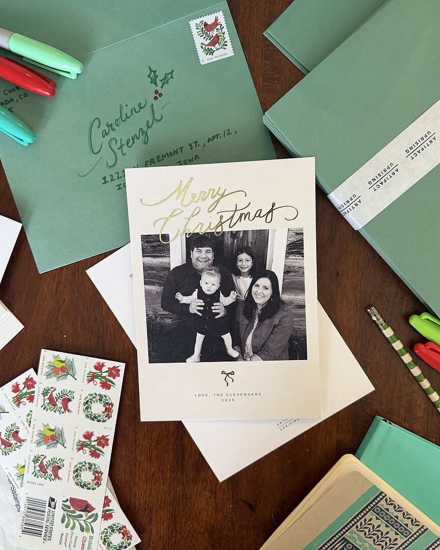
Pike lettering—distinguished by its razor-sharp terminals, pointed mid-stem spurs, and dramatic optical weight—brings a striking blend of vintage sign-painting flair and European folklore aesthetic to greeting cards. Whether you are drafting a bold "MERRY & BRIGHT" or an ornate "NOEL," this typographic discipline provides the crisp structure and festive elegance your seasonal projects need.
What Is Pike Lettering? Anatomy and Character
Pike lettering draws its heritage from late 19th-century circus broadsides, Victorian showcards, and Scandinavian folk typography. Its defining visual hallmark is the "pike" (sometimes called a spur or barb): a sharp, triangular projection that emerges from the vertical, horizontal, or curved stems of letterforms.
Unlike standard block serifs or Roman typography, pike letterforms feature several unique anatomical traits:
- Medial Spurs (Pikes): Distinct, needle-like wedges protruding horizontally or diagonally from the waistline of stems (seen prominently on letters like E, H, L, and B).
- Chiseled Terminals: Stroke endings that taper to needle points or flare slightly before coming to an angular, diamond-like edge.
- High Contrast or Uniform Monoline Weight: Pike styles can be constructed either as bold, high-contrast display faces (thick verticals, thin horizontals) or as consistent, modern monoline weights built with gel or ruling pens.
For holiday designs, pike lettering introduces an architectural crispness that immediately evokes winter imagery: icicles, pine needles, crystalline snowflakes, and retro mid-century holiday displays.
Essential Tools for Clean, Crisp Lettering
Because pike lettering depends on sharp geometries and immaculate edges, using the right tools will save you hours of frustration.
1. Paper and Cardstock
Avoid porous, fibrous cardstock that causes ink to feather. Instead, opt for heavyweight smooth Bristol board (at least 270 gsm), hot-press watercolor paper, or pre-folded cotton greeting cards with a smooth, plate finish. If you plan to use wet media or metallic gouache, ensure your paper is sized for wet techniques.
2. Drafting Implements
- Hard Graphite Pencil (2H to 4H): Leaves faint, smudge-resistant guidelines that erase cleanly without scuffing the paper.
- C-Thru Ruler or T-Square: Vital for aligning baselines, cap heights, and consistent mid-point pike alignments.
- Kneaded Eraser: Lifts graphite safely without tearing paper fibers or leaving rubber debris.
3. Inking Mediums
- Technical Fineliners: Sizes 0.1 to 0.8 mm (such as pigment-based archival pens) for building outlines and filling precise pikes.
- Metallic Gouache: Rich gold, silver, or bronze gouache applied with a fine round brush (size 0 or 1) gives holiday cards a luminous finish.
- Opaque White Ink: Bleed-proof white ink works wonders when working on deep navy, forest green, or burgundy cardstock.
Step-by-Step: Master the Art of Pike Lettering for Holiday Cards
Pike lettering requires patience, careful construction, and deliberate execution. Follow this structured process to build consistent, stunning letterforms from scratch.
Step 1: Lay Down Your Structural Grid
Never freehand pike lettering directly onto finished cardstock. Lightly sketch four horizontal reference lines using your 2H pencil:
- Ascender Line: Defines the height of tall lowercase stems (if using mixed case).
- Cap Height: Marks the top of uppercase characters.
- Waistline / Pike Guide: The optical center line where medial pikes will align.
- Baseline: The resting line for all letter bottoms.
For greeting cards, keeping the waistline slightly above the true mechanical center (around 55% of the total height) gives the letters an elegant, high-waisted vintage posture.
Step 2: Construct the Skeleton Letterforms
Block in your holiday sentiment using simple, single-line geometric capitals. Focus entirely on consistent character width and balanced kerning (the spacing between characters). Ensure symmetrical letters like O, A, and M have equal balance on both sides of their vertical axes.
Step 3: Add Stroke Thickness and Form

Once the skeleton is spaced harmoniously, thicken the vertical stems while keeping horizontals and crossbars slightly lighter. If you are drawing a monoline modern variant, expand all strokes evenly around your primary skeleton lines.
Step 4: Sculpt the Signature Pikes
Now, build the defining feature. At the intersection of your waistline guide and the outer edges of the stems, draw small, sharp triangles extending outward. A traditional pike extends between 1.5 to 2.5 millimeters beyond the main stem on a 1-inch-tall letter.
Keep the angle of your pikes uniform across the entire word. If the pike on your H juts out at a 45-degree angle, ensure the pikes on your E, R, and Y mirror that identical slant.
Step 5: Inking and Refinement
Trace your outlines with a fine-tipped archival pen (0.2 or 0.3 mm). Pay special attention to the terminals of the pikes—flick your wrist outward to feather the stroke into a razor-sharp tip. Fill the main letter body with a larger nib or brush pen, and allow the ink to cure fully before lifting underlying graphite lines with a kneaded eraser.
Festive Styling and Decorative Treatments
Once you have mastered the foundational letter construction, bring seasonal spirit to your cards with these bespoke design enhancements:
1. The Split-Color Infill
Divide your letters horizontally along the pike guide line. Paint the upper half of the letter in deep cranberry red or evergreen, and render the bottom half in antique gold gouache. The pike naturally masks the transition point, creating a clean, jewel-toned two-tone effect.
2. Drop Shadows and Chiseled Dimensions
Pike lettering lends itself naturally to 3D relief. Draw parallel drop shadow lines cast at a consistent 45-degree angle toward the bottom right. Fill the shadow with stippling, hatching, or a secondary contrasting ink like muted charcoal or metallic bronze to make your letters lift off the paper surface.
3. Botanical Interlacing
The rigid, sharp geometry of pike lettering forms a breathtaking contrast with organic holiday botanicals. Weave small sprigs of holly, eucalyptus leaves, or winter berries behind and through the stems and spurs of your focal word.
Layout Strategies for Greeting Cards
A beautifully executed word can fall flat if placed poorly within the card composition. Consider these classic layouts:
- Stacked Hierarchy: Reserve pike lettering exclusively for your focal holiday word (e.g., "PEACE" or "WINTER"), while rendering secondary sentiments ("wishing you comfort & joy") in an understated, monoline sans-serif or delicate cursive beneath it.
- Arched Banners: Draw your baseline along a gentle circular arc across the top third of the card. Pike letters maintain their internal structure well along curved paths, framing an illustrated wreath or family portrait below.
- Central Emblem: Center a single dramatic monogram (such as the initial of the recipient's surname) in oversized pike lettering, surrounded by a minimal geometric or botanical border.
Troubleshooting Common Lettering Mistakes
If your letters feel unbalanced, review these common pitfalls:
- Overcrowded Spurs: Placing pikes on both sides of every single stroke creates visual chaos. Restrict spurs primarily to the exterior silhouettes of letters to preserve legibility.
- Wobbly Points: If your pen leaves blunt, rounded tips instead of needle points, use a micro-fine drafting pen (0.05 mm) to cleanly pull the final tip outward.
- Uneven Waistlines: If the central pikes do not line up across an entire word, the composition will look ungrounded. Always draft a shared horizontal guide for mid-stem spurs.
Handcrafted holiday stationery carries personal sentiment that digital printing simply cannot replicate. By mastering the disciplined lines, balanced spurs, and rich personality of pike lettering, you will craft striking cards that bring timeless holiday elegance to every home they reach.


