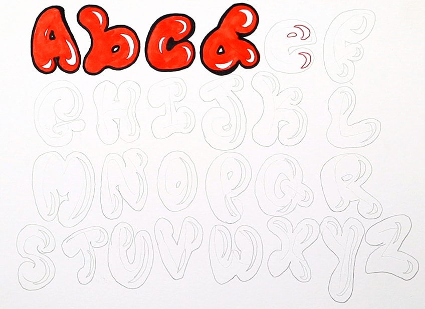
Mastering the Bubble Letter Alphabet
Bubble letters are a timeless staple of creative typography, graffiti art, and playful design. Characterized by their soft, rounded edges and plump, inflated appearance, these letters instantly draw the eye and inject a sense of fun into any project. Whether you are designing a custom greeting card, sketching a poster, or simply filling up your sketchbook, mastering the art of the bubble letter alphabet for creative typography is a rewarding skill that opens up endless design possibilities.

While bubble letters look effortless, creating clean, balanced compositions requires an understanding of basic structure and proportions. This comprehensive guide will walk you through the anatomy of bubble letters, provide a step-by-step drawing method, and share tips for adding stunning 3D effects.
The Anatomy of a Bubble Letter
Before you put marker to paper, it helps to understand what makes a bubble letter look convincing. Unlike standard block letters, bubble letters rely on curves, negative space, and exaggerated weight.
- Rounded Terminals: Sharp corners are replaced with smooth, semicircular caps at the ends of strokes.
- Puffed-Out Centers: The middle of each letter expands outward, mimicking how an actual balloon or bubble inflates under pressure.
- Consistent Weight: While individual letters might swell, the overall line weight across the entire word should remain relatively uniform to maintain visual harmony.
- Preserved Negative Space: Enclosed spaces—like the holes in an 'A', 'B', or 'O' (known as counters)—must remain visible, though they often shrink to tiny slits or round eyes.
Step-by-Step Guide to Drawing Bubble Letters
The easiest way to learn how to draw bubble letters is by starting with a standard skeleton and building the volume outward. Follow this simple four-step process for every letter in the alphabet.
Step 1: Sketch the Skeleton
Lightly draw your word or phrase using plain, simple block letters or stick figures. Use a pencil and don't press too hard, as you will erase these guidelines later. Keep your spacing slightly wider than normal to allow room for the inflated borders.
Step 2: Add the Outline
Imagine your pencil is tracing around an invisible sausage or balloon wrapped tightly around your skeleton letter. Draw a smooth, continuous outline that loops around the outside of your pencil guide. Keep your corners curved and let the sides bulge outward.
Step 3: Clean Up and Refine

Once you have your outer bubble contour, erase the original pencil skeleton inside. Check your proportions. Are the letters balanced? Do they flow well together? Adjust any misshapen curves before moving on to final inks and colors.
Step 4: Add Highlights and Shadows
Flat bubble letters look nice, but adding dimension transforms them into professional-grade typography. Use a darker marker or colored pencil to cast shadows underneath and to the right of each letter. Then, use a white gel pen or digital brush to add sharp, curved highlights along the top-left edges.
Advanced Techniques for Creative Typography
Once you can comfortably draw the standard alphabet, you can experiment with variations to make your typography truly unique.
- Overlapping Letters: Have your letters lean against or overlap one another. To make this work, ensure you draw shadow lines where one letter casts a shadow onto the letter beneath it.
- Stretched and Squashed Bubbles: Experiment with height. Make your letters tall and skinny like balloons, or short and wide like squished marshmallows.
- Liquid and Dripping Effects: Extend the bottom of your bubbles into dripping meltdowns for a fun, gooey aesthetic that works great for summer themes or food-related designs.
- Patterned Fills: Instead of solid colors, fill your letters with stripes, polka dots, checkerboard patterns, or smooth gradients.
Common Mistakes to Avoid
Even experienced designers occasionally fall into traps when rendering bubble typography. Keep these pitfalls in mind:
The most common mistake is inconsistent volume. If one letter is skinny and the next is overly plump, the word will look disjointed. Always step back and view your word as a cohesive shape rather than a collection of isolated letters. Additionally, avoid making your inner counters too large; if the hole in an 'R' is too big, it starts to look like a standard font rather than an inflated bubble.
Conclusion
Mastering the bubble letter alphabet takes a bit of practice, but because the style is inherently loose and forgiving, it is one of the most enjoyable lettering styles to learn. Grab a sketchbook, start with simple words, and experiment with shadows and colors to watch your creative typography pop off the page.