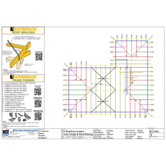
Minimalist Truss Layouts for US Letter Print
When drafting structural diagrams, architectural concepts, or engineering schematics, finding the right balance between detail and whitespace is essential. Utilizing minimalist truss layouts for US Letter print allows designers to communicate complex structural ideas cleanly without overwhelming the page. Because US Letter (8.5 x 11 inches) is the standard paper format in North America for professional and academic documentation, designing specifically for its physical constraints ensures your technical drawings remain legible, balanced, and professional.

Understanding US Letter Proportions for Structural Art
The standard US Letter sheet has an aspect ratio of roughly 1:1.294. This vertical or horizontal canvas provides a specific framing window that influences how your eyes travel across a structural diagram. Unlike large-format architectural plots (ANSI D or E), an 8.5 x 11-inch document forces you to prioritize clarity over exhaustive detailing.
Minimalism in structural drafting is not about leaving out important engineering data; it is about hierarchy. By stripping away extraneous grid lines, heavy decorative borders, and redundant dimensions, you let the geometry of the truss take center stage. This approach works exceptionally well for portfolio pieces, conceptual sketches, and educational handouts.
Core Principles of Minimalist Truss Design
To create a layout that translates effectively to standard office or home printers, you must establish strict visual rules. A minimalist layout relies on precision, negative space, and deliberate line weights.
Line Weight Hierarchy
A successful print starts with contrasting line weights. If every line in your truss layout has the same thickness, the drawing will look flat and unreadable.
- Chords (Top and Bottom): Use a medium-thick stroke (e.g., 0.5mm to 0.7mm) to define the primary load-bearing boundaries of the truss.
- Web Members (Diagonals and Verticals): Use a lighter stroke (e.g., 0.25mm to 0.35mm) for internal members to create depth and visual breathing room.
- Centerlines and Annotations: Keep these extremely thin (0.15mm) and subdued so they do not distract from the structural geometry.
Embracing Negative Space
Do not fill every square inch of the 8.5 x 11 canvas. A well-designed page should feature generous margins—at least 0.75 inches on all sides. This framing isolates the truss layout, making it look like an intentional piece of technical art rather than a cramped engineering spreadsheet.
Step-by-Step Layout Workflow
Video: Truss LAYOUT Drawing Tutorial

Translating a digital CAD model into a crisp physical print requires a repeatable workflow. Follow these steps to ensure your layout translates cleanly from screen to paper.
- Set up your canvas: Open your vector software (such as Adobe Illustrator, AutoCAD, or Inkscape) and create a custom document sized strictly to 8.5 x 11 inches.
- Define your orientation: Choose landscape orientation for long, low-profile trusses (like Pratt or Howe configurations) or portrait orientation for tall towers and vertical space frames.
- Center the geometry: Align your primary truss assembly to the optical center of the page, slightly shifting it upward if you intend to include a minimalist title block at the bottom.
- Apply a monochrome palette: Stick to pure black vector lines on a crisp white background. Avoid gray gradients or drop shadows, which often print muddy on standard desktop inkjet or laser printers.
Choosing the Right Truss Geometries
Not all structural frameworks lend themselves well to a minimalist aesthetic. Complex complex space frames can quickly turn into visual clutter when compressed down to an 8.5 x 11-inch sheet. Stick to clean, geometric typologies that emphasize symmetry and repetition.
Pratt and Warren Trusses
The Pratt truss, with its diagonals pointing down toward the center, and the Warren truss, featuring alternating equilateral triangles, offer inherent rhythm. This repetition is naturally pleasing to the human eye, making them ideal candidates for minimalist presentation sheets.
Space Frames and 3D Projections
If you are drafting a three-dimensional isometric truss, use hidden-line removal or wireframe rendering modes. Keep perspective distortion subtle so the underlying geometric grid remains legible at a glance.
Printing Best Practices for US Letter
Even the most pristine digital layout can be ruined by poor printer settings. To achieve crisp, publication-quality results on US Letter paper, pay close attention to your output settings.
- Scale at 100%: Ensure your PDF viewer or printing software is not set to "Fit to Page," which can inadvertently rescale vector lines and ruin dimension accuracy.
- Use Heavyweight Matte Paper: Standard 20lb copy paper often allows ink to bleed slightly, feathering fine truss lines. Upgrade to 28lb or 32lb bright white presentation paper for sharper edges.
- Disable Ink Saving Modes: Set your printer quality to "High" or "Best" rather than "Draft" or "Eco" to ensure solid, pitch-black lines without banding.
Conclusion
Designing minimalist truss layouts for US Letter print is an exercise in restraint and precision. By focusing on clean line hierarchies, generous margins, and deliberate geometry, you can transform standard office paper into a canvas for elegant structural design. Whether for professional portfolios, structural studies, or interior decor, these simple layout strategies ensure your engineering concepts are communicated with maximum visual impact.