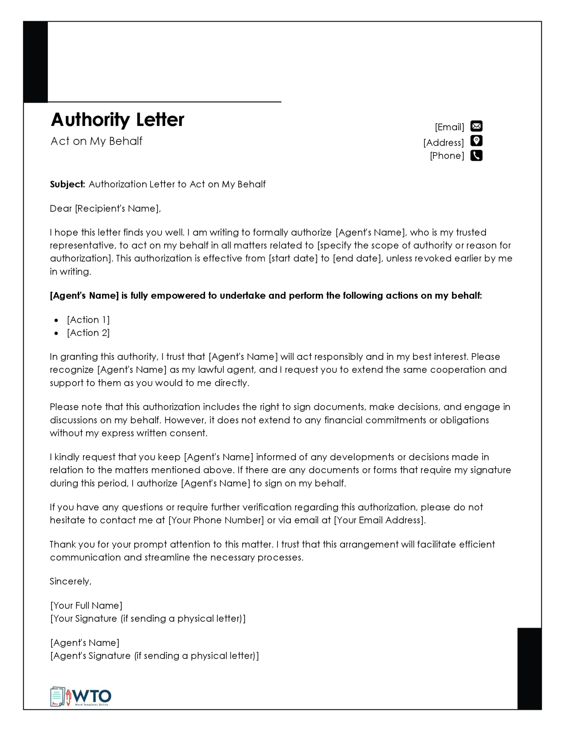
Must Have US Letter Insensibility Guide
When designing documents for an American audience, getting your page dimensions and layout right is critical. Whether you are formatting a corporate report, a legal brief, or a creative flyer, overlooking standard paper sizes leads to awkward clipping, misaligned prints, and unprofessional results. This Must Have US Letter Insensibility Guide is designed to clear up common formatting confusion and give you exact, actionable specifications for flawless print and digital outputs.

Understanding US Letter Dimensions and Geometry
Unlike much of the world that relies on the ISO 216 standard (such as A4), the United States, Canada, and parts of Central America use the Letter size format. Designing without knowing the exact millimeter or inch measurements often results in scaled documents that cut off vital text when printed.
Exact Size Specifications
The standard US Letter page measures exactly:
- Inches: 8.5 x 11 inches
- Millimeters: 215.9 x 279.4 mm
- Points: 612 x 792 points
Keep these numbers in mind when setting up custom document sizes in software like Adobe InDesign, Microsoft Word, or Google Docs. Ensuring your canvas matches these dimensions prevents the software from automatically compressing your work to fit default printer trays.
Setting Safe Margins and Bleeds
One of the most common pitfalls in document design is placing crucial text or graphics too close to the edge of the paper. Standard desktop printers cannot print all the way to the physical edge of the page, meaning anything in the unprintable margin zone will be chopped off.
Standard Margins vs. Printer Limitations
To ensure your content is fully readable, follow these margin guidelines:
- Standard Office Documents: Maintain a minimum of 0.75 inches (54pt) to 1 inch (72pt) on all sides. This leaves enough room for standard binding, hole punching, or clipping.
- Professional Publications: For brochures or booklets, keep a minimum 0.5-inch margin, but increase the inside gutter margin to at least 0.75 inches to account for spine binding.
- Bleed and Slug: If your design features background colors or images that run to the edge of the page, extend your background by 0.125 inches on all sides to create a proper print bleed.
Typography and Readability on Letter Sized Pages
Because an 8.5 x 11-inch page has a substantial surface area, typography choices dictate how readable your document will be. Cramming too much text onto a US Letter page overwhelms the reader, while excessive white space can make the layout look empty.
Recommended Font Sizes and Line Spacing

Optimizing your typography ensures that your content guides the reader's eye naturally down the page:
- Body Text: Use 10 to 12-point serif fonts (like Times New Roman or Georgia) for long-form reading, or clean sans-serif fonts (like Helvetica or Arial) for modern corporate reports.
- Headings: Make primary headers (H1) 24 to 28 points, secondary headers (H2) 16 to 20 points, and subheaders (H3) 13 to 15 points.
- Line Spacing (Leading): Set your line height to roughly 120% to 145% of your font size. For 11-point text, a 14-to-15-point leading prevents lines from feeling cramped.
Common Pitfalls to Avoid
Even experienced designers sometimes fall into traps when preparing files specifically for the US market. Keep these quick checks in mind before hitting export:
1. Confusing A4 and US Letter
A4 paper is slightly narrower and taller (8.27 x 11.69 inches) compared to US Letter (8.5 x 11 inches). If you send an A4 document to an American printer without resizing, the bottom will likely get clipped, or the printer will throw a paper size mismatch error.
2. Ignoring Resolution (DPI)
For print-ready US Letter documents, always design at 300 Dots Per Inch (DPI). Designing at screen resolution (72 DPI) will result in pixelated, blurry text and images when physical copies roll off the press.
3. Forgetting Color Profiles
Design your layouts in CMYK mode if they are destined for commercial offset or digital printing. RGB mode should only be used if the US Letter document will live strictly as a downloadable PDF on a website or email attachment.
Final Checklist for Your US Letter Document
Before you publish, print, or share your file, run through this final sanity check:
- Is the canvas size explicitly set to 8.5 x 11 inches?
- Are all essential text elements inside the 0.75-inch safety margin?
- Is the export format set to high-quality PDF with crop marks and bleeds (if printing professionally)?
- Have you proofread the document at 100% zoom to check visual hierarchy and spacing?
By keeping these core dimensions, margin rules, and typography standards in mind, you will produce professional, perfectly scaled documents every single time.