Optimizing for Mobile Users: Best Practices
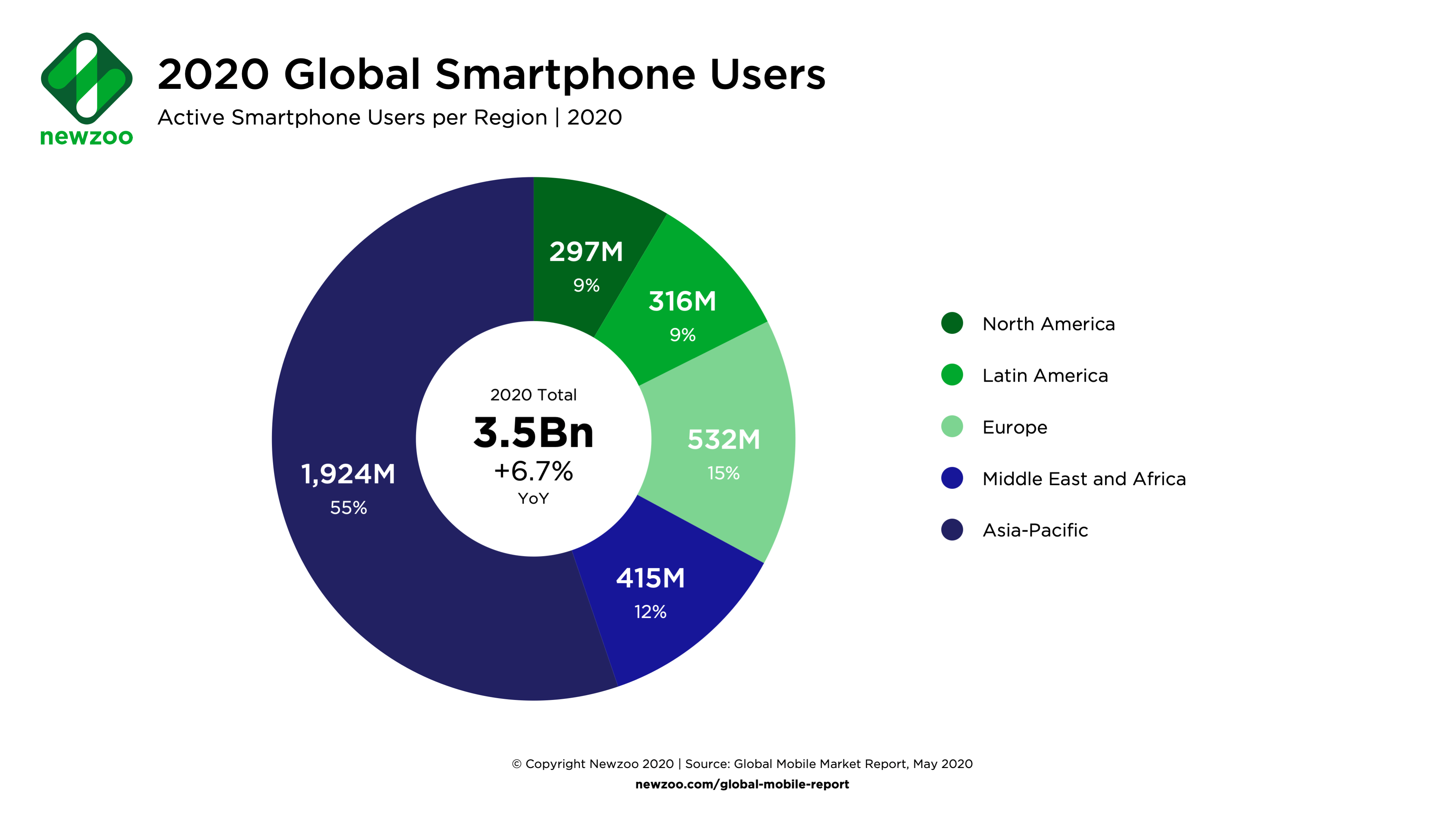
Today, smartphones and tablets are the primary gateways to the internet for a massive majority of mobile users globally. Whether they are browsing social media, reading the news, or purchasing products, people expect digital experiences that are fast, intuitive, and frictionless. If your website or application fails to meet these expectations, visitors will leave within seconds for a competitor who delivers a better experience.

Understanding Mobile Users and Their Behavior
To design effective digital touchpoints, you first need to understand how people interact with handheld devices. Unlike desktop users who often sit at a desk with large screens and fast, stable broadband connections, mobile users are frequently on the move. They might be browsing on a crowded train, quickly checking a price in a physical store, or multitasking at home.
Because of these environments, smartphone users exhibit distinct behavioral traits:
- Shorter attention spans: Users want immediate answers and clear calls to action without digging through menus.
- Impatient with latency: Even a one-second delay in page load time can drastically increase bounce rates.
- Variable connectivity: Connections can fluctuate rapidly from 5G to weak 4G or spotty Wi-Fi.
Core Strategies for Engaging Mobile Users
Creating a mobile-friendly ecosystem requires a shift in how you approach design, development, and content strategy. By focusing on the core pillars of mobile usability, you can turn casual visitors into loyal customers.
1. Prioritize Lightning-Fast Page Speed
Speed is the single most important factor in mobile user retention. Heavy images, bloated JavaScript, and unoptimized code can cripple your performance on mobile devices. To improve load times, compress high-resolution images, leverage browser caching, and implement a Content Delivery Network (CDN) to serve assets closer to the user's geographic location.
2. Implement Responsive Design
A responsive layout automatically adjusts its elements to fit screens of any size, from small budget smartphones to large tablets. Ensure that your text scales gracefully without requiring horizontal scrolling, and use flexible grids and CSS media queries. Every element on the page should reflow logically as the screen dimensions change.
Furthermore, pay close attention to touch targets. On a desktop, a user clicks with a precise mouse cursor. On a mobile device, users tap with their fingers. Buttons, links, and form fields must be large enough—typically at least 48x48 pixels—and spaced adequately apart to prevent accidental taps and user frustration.

3. Streamline Navigation and Forms
Complex navigation menus that work well on desktop sites often fail miserably on small screens. Simplify your site architecture by utilizing a clean 'hamburger' menu or a bottom navigation bar for quick access to key sections. Keep the user journey straightforward, minimizing the number of taps required to reach a destination.
When it comes to forms, less is always more. Every additional field you ask a user to fill out on a smartphone increases friction and abandonment rates. Use autofill attributes whenever possible, adopt smart input types (like triggering a numeric keypad for phone number fields), and enable guest checkout options for e-commerce platforms.
Optimizing Content for Readability
Long blocks of dense text are notoriously difficult to read on small screens. When writing for mobile audiences, your formatting matters just as much as your copywriting.
- Keep paragraphs short: Stick to two to three sentences per paragraph to create white space and prevent visual fatigue.
- Use descriptive subheadings: Break your content into digestible sections so readers can easily scan for the information they need.
- Leverage bullet points: Lists make complex information far easier to digest at a glance.
Testing and Continuous Improvement
You cannot simply launch a mobile site and forget about it. Digital standards evolve rapidly, and device types change constantly. Regularly test your platform across a wide variety of real smartphones and tablets using tools like Google Lighthouse and real-device testing platforms.
Monitor your analytics to see how mobile users interact with specific pages. Pay attention to metrics like mobile conversion rates, exit rates, and average session duration. If you notice a high drop-off rate on a particular mobile checkout page, investigate immediately for usability roadblocks.
Conclusion
Adapting to the needs of modern mobile users is no longer optional; it is a fundamental requirement for digital success. By prioritizing speed, responsive design, simplified navigation, and readable content, you build a foundation that respects your audience's time and attention. Invest in the mobile experience today, and reap the rewards of higher engagement, better conversions, and stronger customer loyalty tomorrow.