Paramount Pictures CLG Wiki: Logo History Guide
For film historians, nostalgic moviegoers, and branding archivists, searching for the paramount pictures clg wiki entry is practically a rite of passage. The Closing Logo Group (CLG) Wiki—now officially operating as the Audiovisual Identity Database (AVID)—serves as the Internet's foremost clearinghouse for motion picture production logos. Among thousands of studio entries, few command as much fascination, documentation, and archival detail as Paramount Pictures and its legendary snowcapped peak.

Known affectionately as the "Majestic Mountain," Paramount's on-screen identity is the oldest surviving film studio logo in Hollywood history. The CLG Wiki community has meticulously chronicled every iteration, sound variant, and subtle production change this emblem has undergone since its silent-era debut. Here is a deep dive into the history, variants, and cultural significance behind the famous mountain.
What Is the Paramount Pictures CLG Wiki Archive?
The CLG Wiki originated as an online collective dedicated to cataloging production company vanity cards, opening idents, and distributor bumpers. Members document exact visual descriptions, musical themes, historical availability, and even community-awarded "scare factors" (a quirky relic of the wiki's early 2000s roots).
On the wiki, Paramount’s master entry is massive. It captures more than a century of changes, tracing how a hand-drawn mountain encircled by stars evolved into photorealistic CGI. The community analyzes everything down to print variations, aspect ratio shifts, and the controversial "plastering" phenomenon, where newer studio logos are retroactively edited over vintage releases on home video and streaming services.
Chronological Evolution of the Paramount Mountain
The core concept of Paramount’s visual brand emerged in 1914, credited to studio founder W.W. Hodkinson. During a meeting with producer Adolph Zukor, Hodkinson sketched a mountain reminiscent of Ben Lomond peak from his childhood in Utah. Over the decades, that sketch transformed through several distinct eras.
1. The Silent Era and the 24 Stars (1914–1952)
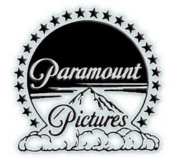
The earliest versions featured a dark, craggy peak flanked by clouds and crowned with an arc of 24 five-pointed stars. Legend states that the 24 stars originally symbolized the 24 actors and actresses contracted to Paramount under the classic Hollywood studio system. These early title cards appeared on silent classics like Wings (1927), varying wildly in cloud movement, typeface, and contrast depending on the processing lab.
2. The VistaVision and Color Revolution (1953–1975)
With the rise of widescreen cinema and Technicolor, Paramount introduced the famous "VistaVision Mountain" in 1954. The mountain model shifted, supposedly taking cues from Mount Artesonraju in the Peruvian Andes. The stars were reduced to 22, the backdrop turned a rich, painted twilight blue, and dramatic cumulus clouds billowed over the summit. This iteration greeted audiences during Hollywood's golden age of epics, including The Ten Commandments (1956) and Vertigo (1958).
3. The "Blue Mountain" Era (1975–1986)
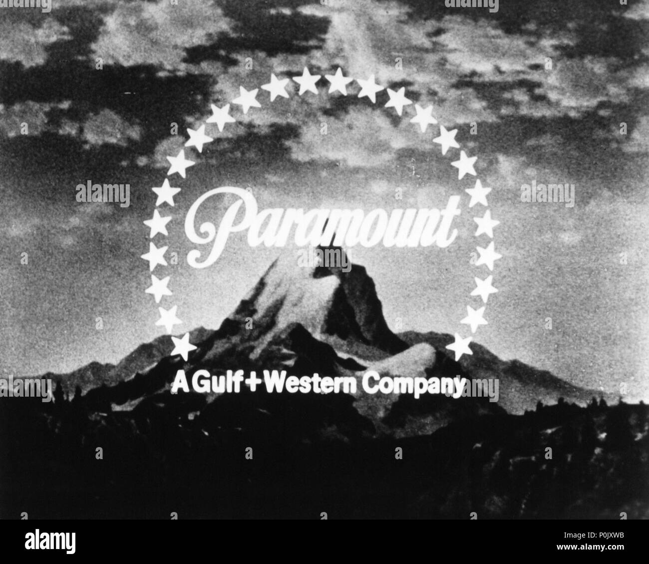
In late 1975, Paramount modernized in step with corporate minimalism. Dubbed by the CLG Wiki community as the "Blue Mountain" or "Square Mountain," this design dropped realistic scenery in favor of a stylized, geometric mountain silhouette set against a bright cyan background, framed by 22 stars. A Gulf+Western company byline sat at the bottom. While controversial among traditionalists at the time, this sleek mark became synonymous with 1970s and 1980s blockbusters like Saturday Night Fever, Grease, and early installments of the Star Trek and Friday the 13th franchises.

4. The 75th Anniversary Painting and Digital Realism (1986–2002)
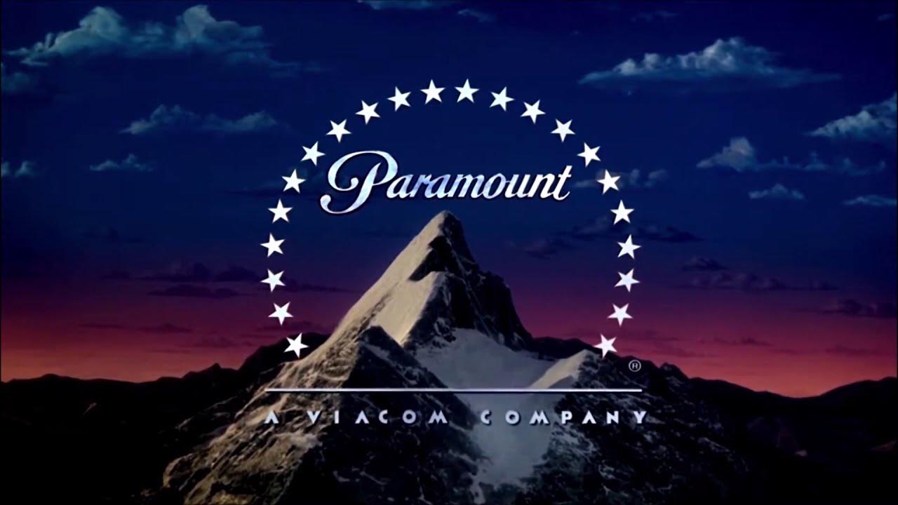
To celebrate its 75th anniversary in 1986, Paramount abandoned corporate abstraction and returned to majestic realism. Renowned artist Dario Campanile was commissioned to paint a warm, photorealistic mountain peak at sunset, surrounded by soft pink and orange clouds. In 1999, digital animators enhanced Campanile’s painting with subtle computer-generated cloud drift and sparkling star paths.
5. The Modern CGI Peaks (2002–Present)
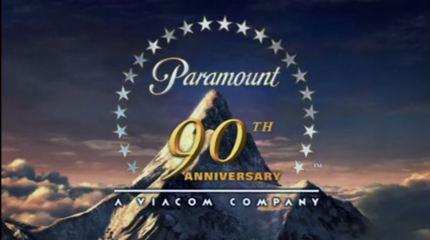
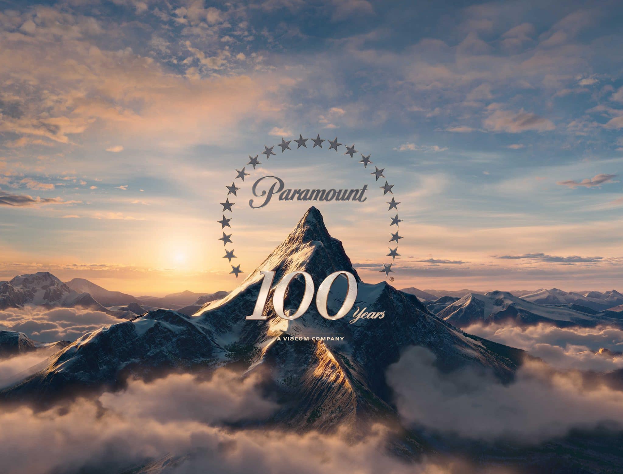
For its 90th anniversary in 2002, Paramount introduced its first entirely computer-generated ident, produced by BUF Compagnie. Here, stars skim across a tranquil lake before arcing upward toward the mountain peak. In late 2011, for the studio's centennial, Devastudios overhauled the sequence into the hyper-detailed, photorealistic CGI vista seen today. This version features 22 stars skipping across water, illuminating mountain terrain, and snapping into a halo around a majestic, snow-dusted peak under brilliant sunlight.
Iconic Variants on the Paramount Pictures CLG Wiki
One reason the Paramount page remains one of the most frequently visited on the CLG Wiki is the studio's rich tradition of custom logo variants tailored to specific films. Filmmakers often alter the palette, lighting, or final frame of the intro to establish mood before the story begins.
- Raiders of the Lost Ark (1981): Perhaps the most famous visual match-cut in cinema history. As the Paramount logo fades, the mountain summit directly dissolves into a real, similarly shaped peak in the jungles of South America.
- Coming to America (1988): The logo plays normally, but as the final chord sustains, an African choir vocalizes over the mountain, seamlessly carrying audiences into the fictional kingdom of Zamunda.
- South Park: Bigger, Longer & Uncut (1999): The classic 1986 mountain is rendered in Trey Parker and Matt Stone's signature crude, construction-paper cutout animation style, complete with a deliberately low-fidelity chorus.
- Cloverfield (2008): Reflecting the found-footage premise, the fanfare cuts out abruptly, replacing traditional music with eerie static, digital artifacts, and distant roars.
- Sonic the Hedgehog (2020): The traditional stars encircling the summit are replaced by glowing golden rings from the video game franchise.
The Audio Identity: Fanfares and Themes
While the visual design is universally recognized, Paramount went decades without a single standardized fanfare. Throughout the mid-20th century, the logo usually played silently or was accompanied by the opening overture of the film itself.
In 1976, an electronic swoosh accompanied some television distribution prints, but it was not until the late 1980s and 1990s that Paramount firmly unified its sound. The definitive modern fanfare arrived in 2011 for the studio's 100th anniversary, composed by award-winning film composer Michael Giacchino. Giacchino's brass-and-strings theme balances sweeping nostalgia with modern cinematic punch, perfectly complementing the Devastudios animation.
Why Logo Enthusiasts Keep Documenting
To outside observers, cataloging decades of minor visual updates might seem obsessive. However, the work done on the CLG Wiki / AVID represents grassroots film preservation. Logos provide vital context regarding theatrical release dates, production mergers, distribution agreements, and copyright transfers.
When classic films are restored for 4K Blu-ray or uploaded to streaming platforms, original distributor bumpers are frequently stripped and replaced with modern corporate logos. By maintaining precise descriptions, audio clips, and release logs, the CLG Wiki preserves the authentic opening presentation of classic cinema exactly as audiences experienced it in theaters decades ago.