Red's Arch Nemesis in the Color Wheel Revealed
Understanding Color Theory Basics

Color theory forms the foundation of visual arts, design, and even marketing. To understand how colors interact, professionals rely on the color wheel—a circular arrangement of colors based on chromatic relationship. Within this wheel, certain colors naturally clash, complement, and enhance one another.
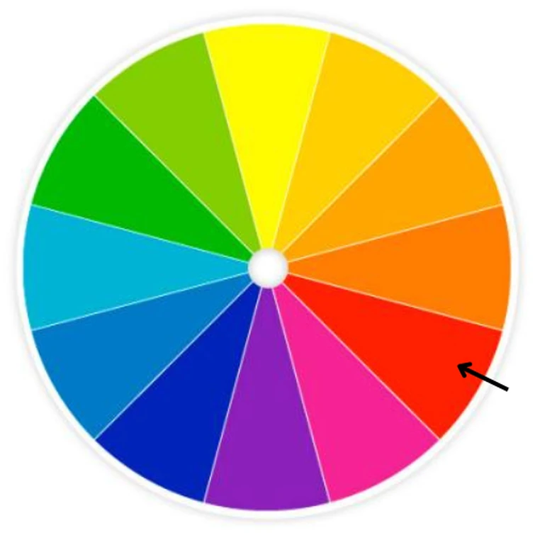
Among the most dramatic relationships in visual design is the dynamic between opposing shades. If you have ever wondered about Red's arch nemesis in the color wheel revealed instantly, the answer lies directly across the color spectrum in the realm of cool tones.
Red's Arch Nemesis in the Color Wheel Revealed
The direct opposite of red on a traditional RYB (Red-Yellow-Blue) color wheel is green. When placed side by side, red and green create the highest possible contrast, making each color appear brighter and more intense. This phenomenon is known as simultaneous contrast.
Why Green is Red's Polar Opposite
In traditional art and color theory, primary, secondary, and tertiary colors are positioned opposite their complementary counterparts. Because red is a primary color, its complementary partner is a secondary color created by mixing the other two primary colors (yellow and blue). Blue and yellow combined make green, cementing its status as red's ultimate counterweight.
- Primary Color: Red
- Mixed Primaries (Yellow + Blue): Green
- Visual Result: Maximum contrast and visual vibration
The Scientific Perspective: RGB vs. RYB
Depending on whether you are working with physical paint or digital screens, the opposing color shifts slightly. On the traditional RYB color wheel used by artists, red's opposite is green. However, in the RGB (Red-Green-Blue) color model used by digital displays, the exact opposite—or complement—of red is cyan, a greenish-blue hue.
Practical Applications of Red and Green
Understanding that green is red's arch nemesis goes beyond academic color theory; it is a practical tool used across various industries to grab attention and evoke specific psychological responses.

1. Branding and Marketing
Brands often use complementary color schemes to make their logos and products pop. While red and green together are heavily associated with Christmas, variations of these tones (like burgundy and sage) are used strategically in packaging to create a balanced, eye-catching shelf presence.
2. Interior Design
Using complementary colors in interior design requires a careful hand. Because red and green are both high-energy colors, using them in equal amounts can overwhelm a room. Designers typically use a dominant neutral palette and introduce red and green as subtle accent pieces—such as a muted olive wall paired with a terracotta or crimson throw pillow.
3. Fine Art and Photography
Painters like Vincent van Gogh famously utilized the stark contrast of red and green to guide the viewer's eye. In his masterpiece *The Night Cafe*, the harsh red walls clash deliberately against the green ceiling, creating an intentional feeling of tension and unease.
Tips for Balancing High-Contrast Colors
Because red and green are exact opposites, they demand respect when used together. Follow these simple guidelines to keep your projects looking professional rather than chaotic:
- Change the saturation: Instead of using bright, primary red with neon green, opt for desaturated versions like brick red and sage green.
- Adjust the proportions: Let one color dominate (e.g., 80% green) while using the other as a sharp, deliberate accent (20% red).
- Use neutrals as a buffer: Whites, grays, and blacks help separate high-contrast colors, giving the viewer's eyes a place to rest.
Conclusion
Whether you are designing a website, painting a canvas, or decorating your living room, knowing your color relationships is essential. Red and green form a powerful, high-contrast partnership that can either cause visual fatigue or create stunning artistic tension. By mastering this relationship, you can control visual hierarchy and make your creative projects truly stand out.