Streamline Your Workflow with a Pantone Color Matcher
Color accuracy is the backbone of professional design. Whether you are building a corporate brand identity, designing product packaging, or setting up files for high-end offset printing, a single mismatched hue can derail an entire project. Designers and printers often lose hours debating whether a shade of blue on a monitor matches the physical ink on a substrate. Fortunately, you can streamline your workflow with a Pantone color matcher, turning a historically subjective guessing game into a precise, repeatable science.

By integrating dedicated color-matching tools—both hardware and software—into your daily routine, you bridge the gap between digital creativity and physical production. This guide explores how these tools work, why they matter, and how adopting them transforms your entire design pipeline.
The Hidden Costs of Color Inconsistency
Ask any creative director or print production manager about their biggest pain points, and color discrepancies will rank near the top. Without a standardized system, color communication relies on vague descriptions like "make it a bit warmer" or "a slightly deeper navy." This ambiguity leads to a cascade of inefficiencies:
- Endless Revisions: Sending proofs back and forth because the printed output doesn't match the client's vision.
- Material Waste: Wasting ink, paper, and substrate during press checks while operators manually adjust ink keys.
- Client Dissatisfaction: Delivering collateral that fails to match brand guidelines, damaging trust and professional reputation.
When you rely on ad-hoc color selection, you bleed time and money. A standardized color matching ecosystem solves these friction points at the source.
How a Pantone Color Matcher Transforms Your Process
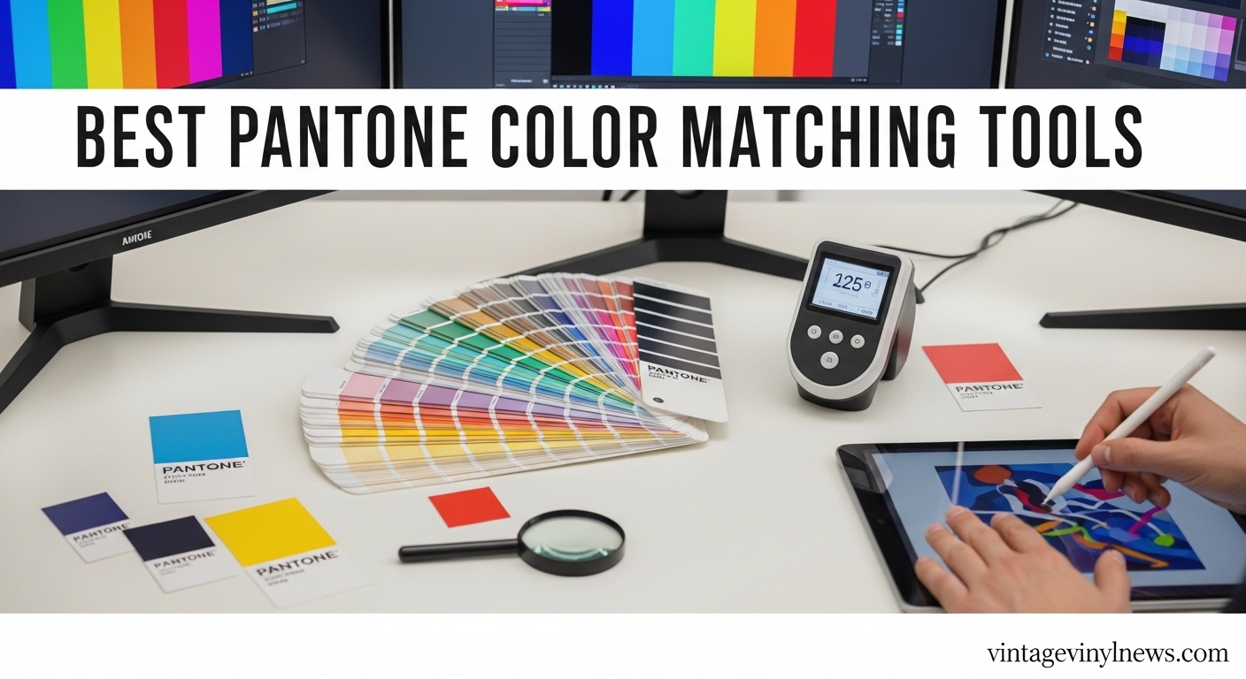
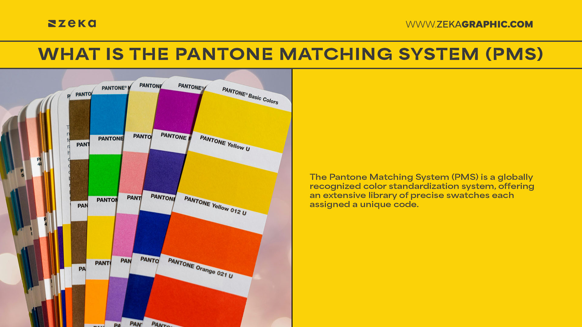
The Pantone Matching System (PMS) has long been the universal language of color. However, simply having a physical swatch book isn't enough in a fast-paced digital environment. Modern color matchers combine physical spectrometers with digital software libraries to deliver instant, accurate results.
Hardware Spectrometers vs. Digital Libraries
Color matching tools generally fall into two categories: physical capture devices and digital extension tools.
Video: Pantone Color Match Card: How to match to a Pantone Color in 25 seconds
Physical devices, such as handheld spectrophotometers, allow you to scan any surface—a painted wall, a fabric swatch, or an old packaging box—and instantly identify the closest Pantone coordinate. This eliminates the need to manually flip through hundreds of pages in a physical fan deck.
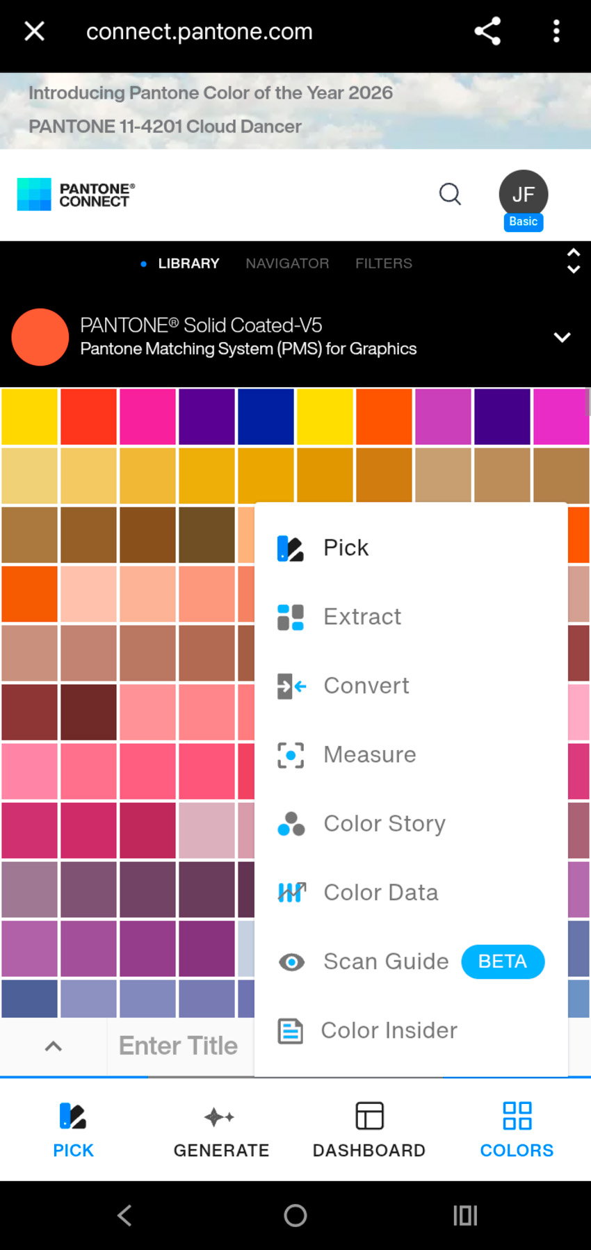
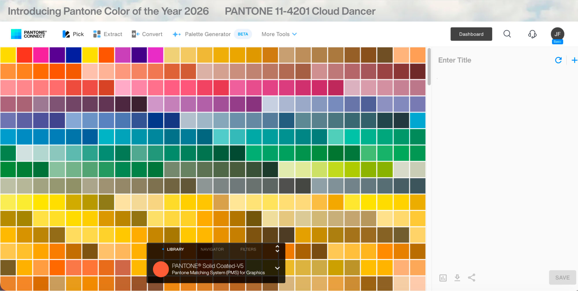
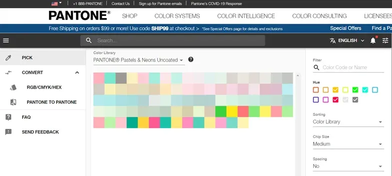
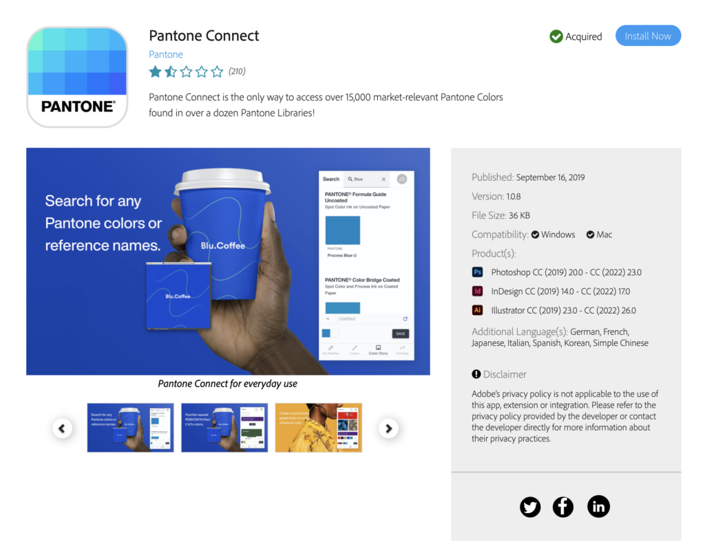
Digital libraries, integrated directly into design software like Adobe Creative Cloud or web-based platforms, ensure that your digital canvas uses legitimate, up-to-date spot colors. Together, they create a seamless bridge from inspiration to execution.
Practical Steps to Streamline Your Workflow with a Pantone Color Matcher
Adopting new technology requires a strategic approach. To get the maximum return on investment from your color tools, follow these foundational steps:
- Calibrate Your Monitors Regularly: Even the best color matchers cannot compensate for a poorly calibrated display. Ensure your screens match industry-standard lighting and color profiles before selecting spot colors.
- Capture and Store Early: If a client hands you a physical object as a color reference, scan it immediately with a hardware matcher. Save the resulting Pantone reference directly into your digital brand guidelines.
- Lock in Spot Colors Early in Design: Avoid converting RGB or CMYK approximations late in the game. Assign official Pantone values at the wireframing and concept stages to prevent unexpected shifts during export.
- Communicate with Your Print Partners: Share your digital color workflow specifications with your printer. When both sides use standardized Pantone references, the proofing process becomes a formality rather than a negotiation.
Benefits Beyond the Print Room
While print production is the most obvious beneficiary, optimizing your color workflow impacts every corner of an organization. Marketing teams enjoy faster asset creation, web designers maintain brand integrity across digital touchpoints, and procurement departments can source matching materials with absolute confidence.
Eliminating subjective debates about color frees up mental bandwidth for what truly matters: creative problem-solving and compelling design. When everyone speaks the same numerical and visual color language, bottlenecks disappear.
Conclusion
In the competitive world of design and manufacturing, efficiency dictates profitability. By choosing to streamline your workflow with a Pantone color matcher, you remove uncertainty, protect brand integrity, and accelerate your time-to-market. Invest in the right tools, standardize your digital and physical touchpoints, and watch your creative operations run smoother than ever before.