Super Bowl 58 Logo: Design, Colors, and Lore
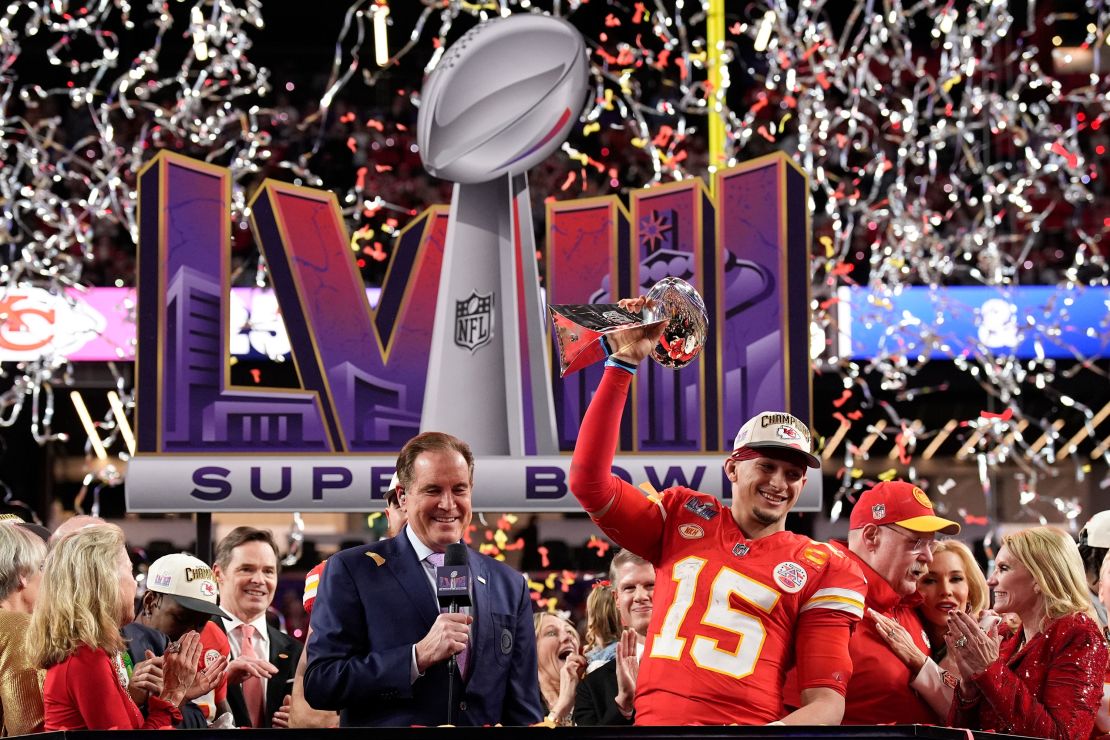
When the NFL unveiled the official super bowl 58 logo on February 13, 2023, the sports design community immediately noticed a bold departure from decades past. Designed to anchor the visual identity of Super Bowl LVIII at Allegiant Stadium in Paradise, Nevada, the emblem was tasked with representing both the majesty of the Vince Lombardi Trophy and the flamboyant energy of Las Vegas. Beyond its aesthetic appeal, the emblem also sparked one of the most entertaining pop-culture conspiracies in recent sports history.
Sports logos must do more than look attractive on a television broadcast. They set the tone for multi-million-dollar merchandise programs, dictate citywide civic decor, and capture a specific moment in sports heritage. The visual system designed for Super Bowl LVIII stands as a pivotal case study in how modern professional leagues balance corporate uniformity with local personality.
The Artistic Breakdown of the Super Bowl 58 Logo
At first glance, the emblem for Super Bowl LVIII presents a striking marriage between the strict geometry of Roman numerals and the warm, luminescent colors of the Nevada desert. To appreciate the craftsmanship of the mark, it helps to examine its individual components.
1. The Las Vegas Color Palette
Unlike the icy silver tones that defined the NFL's championship branding throughout the 2010s, the LVIII emblem features a rich gradient transitioning from deep royal purple to electric magenta and fiery desert orange. This choice was deliberate: the colors evoke both the neon-saturated skyline of the Las Vegas Strip at midnight and the natural, dust-swept sunsets characteristic of the Mojave Desert.
2. Stylized Roman Numerals
The letters "LVIII" feature inward-slanted cutaways, bevels, and backlighting that mirror the classic mid-century roadside signs that made Vegas an American design landmark. The typography gives the illusion of physical illumination, mimicking vintage bulb-and-gas glass tubing without abandoning clean vector precision.
3. The Central Lombardi Trophy
Positioned dead center, the Vince Lombardi Trophy anchors the graphic. Rendered in photorealistic silver with subtle reflections picking up the surrounding magenta and purple hues, the trophy provides continuity across all modern championship editions, ensuring the brand remains instantly identifiable as an elite championship game.
Moving Away from the Chrome Template Era
To fully understand the significance of this design, one must look back at the history of Super Bowl visual identities. NFL branding generally falls into three distinct historical eras:
- The Bespoke Era (1967–2010): Every Super Bowl received an entirely unique, custom-designed emblem. Super Bowl XXX in Arizona featured turquoise accents and Southwest patterns; Super Bowl XXXI in New Orleans featured Mardi Gras flourishes. While beloved by fans, this approach led to inconsistent brand equity.
- The Monolithic Template Era (2011–2021): Beginning with Super Bowl XLV in North Texas, the NFL implemented a rigid, corporate template. Every logo featured a hyper-polished silver Lombardi Trophy perched atop monochrome Roman numerals. While sleek and unified, fans and designers criticized the style as sterile and devoid of host-city culture.
- The Hybrid Identity Era (2022–Present): Starting with Super Bowl LVI in Los Angeles, the league adopted a hybrid system. The standard Roman numeral layout remained, but the interior surfaces and typography opened up to custom illustration, vibrant regional palettes, and collaborations with local communities.
The visual framework of Super Bowl 58 represents the absolute peak of this hybrid philosophy. It preserved the commercial structure required for international retail while completely immersing itself in the distinct attitude of southern Nevada.

The Viral "Scripted Color" Conspiracy Theory
No discussion of the Super Bowl LVIII identity is complete without addressing the internet phenomenon that surrounded it throughout the 2023-2024 NFL regular season: the logo color conspiracy.
The theory originated on social platforms like TikTok and X (formerly Twitter) after fans noticed a curious pattern in the two preceding championships:
- Super Bowl LVI: The logo featured yellow and orange gradients. The game featured the Los Angeles Rams (yellow/blue) defeating the Cincinnati Bengals (black/orange).
- Super Bowl LVII: The logo featured turquoise-teal and bright crimson. The game featured the Philadelphia Eagles (midnight green/teal) facing the Kansas City Chiefs (red).
Because the Super Bowl 58 logo relied heavily on vibrant purple and deep red-orange, amateur sleuths concluded that the NFL was "scripted." The theory gained massive traction, with millions of fans asserting that the championship matchup was already predetermined to be the Baltimore Ravens (purple) versus the San Francisco 49ers (red).
For months, the theory seemed shockingly prescient as both Baltimore and San Francisco secured the No. 1 overall seeds in their respective conferences. However, the myth finally shattered during the AFC Championship Game on January 28, 2024, when Patrick Mahomes and the Kansas City Chiefs defeated the Ravens 17-10 in Baltimore. While the 49ers held up the red half of the equation, the Chiefs' victory decisively proved that graphics teams do not possess psychic powers—or a script to the games.
How the Las Vegas Landscape Shaped the Artwork
Hosting a Super Bowl in Las Vegas had long been considered an impossibility due to the league's historic aversion to sports gambling. Once the Oakland Raiders relocated to Allegiant Stadium and legal wagering gained mainstream acceptance, the city's debut as a Super Bowl host required a visual statement that was unapologetic.
The NFL's internal creative department worked to capture the multisensory environment of Clark County. Las Vegas is a city defined by artificial light juxtaposed against raw, arid geology. The emblem captures this duality by pairing sharp, metallic typography with soft, atmospheric lighting gradients. When scaled across gigantic exterior video boards at the MSG Sphere and projected along the exterior facade of Allegiant Stadium, the logo functioned as natural architecture rather than just an overlay sticker.
The Lasting Influence on NFL Brand Strategy
The artistic and commercial success of the Super Bowl LVIII emblem firmly solidified the league's new design direction. Rather than retreating into sterile corporate templates, the league has deepened its commitment to cultural immersion.
This path was demonstrated immediately for Super Bowl LIX in New Orleans, where the NFL partnered directly with local artist Tahj Williams, a member of the Black Masking Indian community, to craft handcrafted beadwork elements woven directly into the Roman numerals. The vibrant reception of Las Vegas's identity gave the league the confidence to embrace authentic artistic collaboration over corporate safety.
Ultimately, the emblem for Super Bowl 58 will be remembered as more than the backdrop to the Chiefs' thrilling 25-22 overtime victory over the 49ers. It represents a landmark moment where modern sports design, city pride, and internet pop-culture collided to create one of the most memorable visual identities in football history.