Universal Television Logo History: Evolution of the Globe
When the credits roll on some of television's most beloved shows—from Law & Order to The Office—they are frequently capped by one of the most recognizable closing animations in entertainment. Understanding the universal television logo history is more than just a look at graphic design; it is a visual timeline of how television itself grew from a nascent broadcast medium into a global powerhouse.
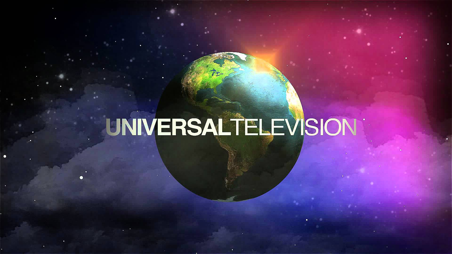
Over the decades, the spinning globe has undergone numerous transformations to reflect changing animation technologies, corporate mergers, and aesthetic trends. Here is how Universal Television's visual signature evolved from the golden age of broadcasting to the modern streaming era.
Early Beginnings and the Print Era
Long before animated computer graphics dominated television screens, production companies relied on static cards or simple optical effects to stamp their ownership onto programs. When Universal Pictures established its television division, the studio naturally leaned into its legendary cinematic heritage—the revolving globe.
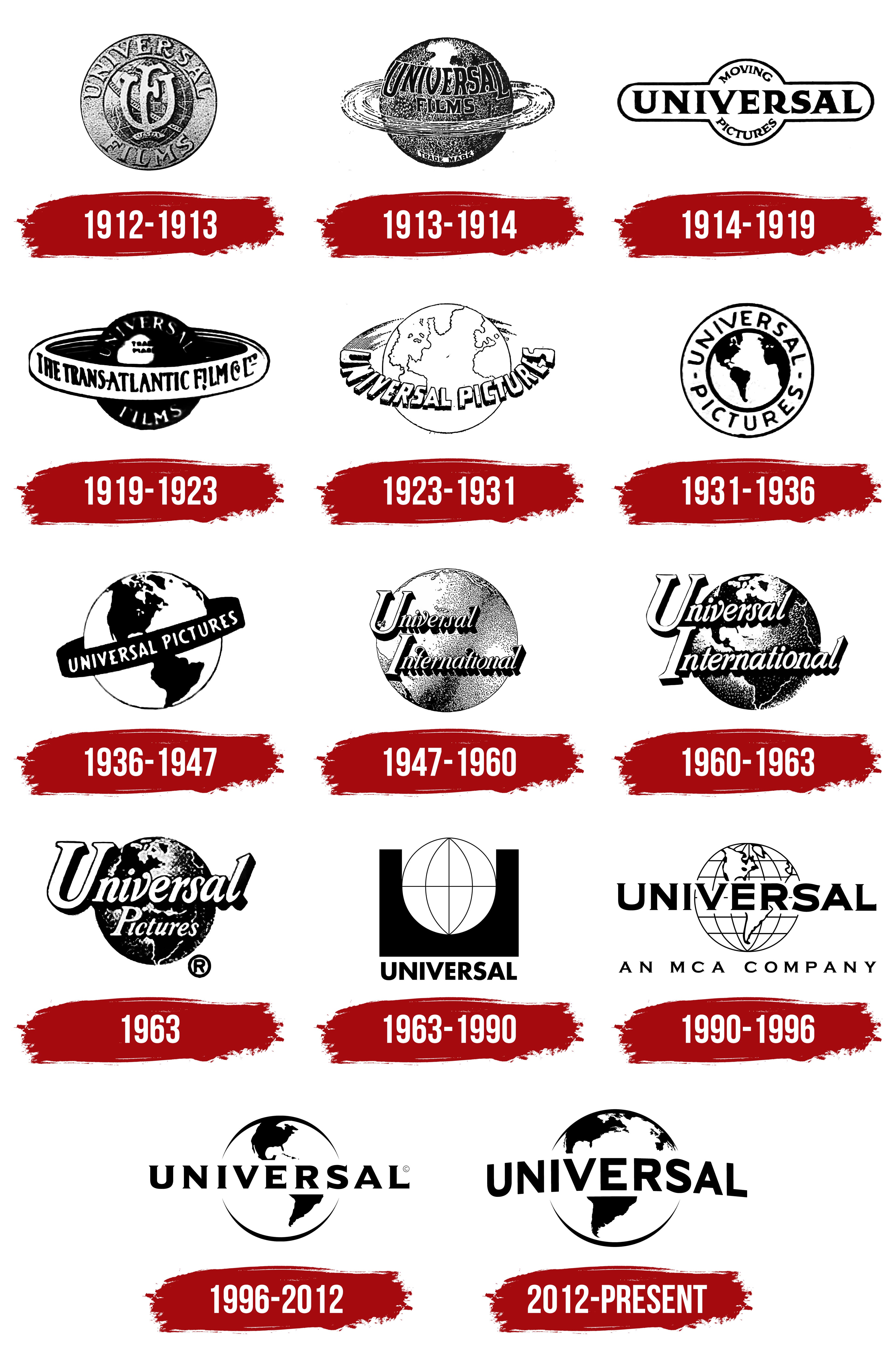
In the 1950s and 1960s, television production credits were brief, functional, and often black-and-white. Universal's early small-screen logo was heavily derivative of its theatrical counterpart, utilizing a physical globe model shot on a soundstage. These early iterations established the core premise that would endure for generations: the planet Earth wrapped in a stylized typographic ring.
The 1970s to 1980s: The Classic Spinning Globe
As color television adoption skyrocketed in the 1970s, Universal Television updated its branding to match the vibrant new medium. This era birthed the most nostalgic iteration of the universal television logo history for millions of viewers who grew up watching syndicated reruns.
Key Features of the 70s and 80s Logo:
- The Painted Globe: A detailed, hand-painted globe featuring North America prominently as it rotated into view.
- The Universal Banner: A bold, sans-serif or slightly modified Futura font reading "UNIVERSAL" arcing across the equator, reminiscent of the feature film opening.
- The Byline: Often accompanied by the iconic MCA Inc. ("An MCA Company") byline at the bottom, reflecting the corporate ownership of the time.
This version of the logo appeared at the end of iconic 70s and 80s hits like Columbo, The Rockford Files, and Miami Vice. It relied on traditional optical printing techniques, giving the globe a warm, slightly grainy texture that fans still cherish today.
The 1990s: Transition to CGI and Modernization
Video: Universal Television Logo History (Updated)

By the 1990s, computer-generated imagery (CGI) began replacing physical models and optical effects across the television industry. Universal Television needed a logo that looked sharper on increasingly high-resolution cathode-ray tube (CRT) displays.
During this decade, the globe was rendered in 3D computer graphics for the first time. The continents gained a subtle topographical depth, and the lighting became more dynamic, simulating a sunlit Earth against a star-filled cosmos. The typography was standardized, and corporate restructuring led to frequent updates in the accompanying bylines—shifting from MCA to Studios USA, and later to NBC Universal.
The 2000s to Present: Digital Sleekness and Consolidation
Following Comcast’s acquisition of NBCUniversal, the studio branding entered a sleek, highly polished era. The universal television logo history took a definitive digital turn in the 2010s and 2020s, aligning the television division more closely with its theatrical parent.
Modern Design Shifts
Modern iterations of the logo favor minimalism and photorealism. The current animated sequence features a hyper-detailed, slowly rotating globe encircled by a glistening, reflective metallic banner with the word "UNIVERSAL" embossed across it. Clouds drift realistically over the continents, and camera flares mimic high-end cinematic lens effects.
Furthermore, contemporary television branding often features tailored variants:
- Universal Television Alternative Studio: Used for unscripted and reality programming.
- Universal International Studios: Focused on global productions based outside the United States.
- Streaming Variants: Shorter, punchier animations designed to play seamlessly on platforms like Netflix, Peacock, and Amazon Prime.
Why the Universal Globe Endures
Few production logos have survived the test of time quite like Universal's. While competitors like Warner Bros. and Paramount have also iterated on their historic imagery, the spinning globe remains an international symbol of storytelling scale. By bridging the gap between old Hollywood glamour and cutting-edge digital rendering, the Universal Television logo continues to signal quality entertainment to audiences worldwide, ensuring its legacy remains secure for decades to come.