Unlock Cell Secrets with Vintage Inspired Graphics
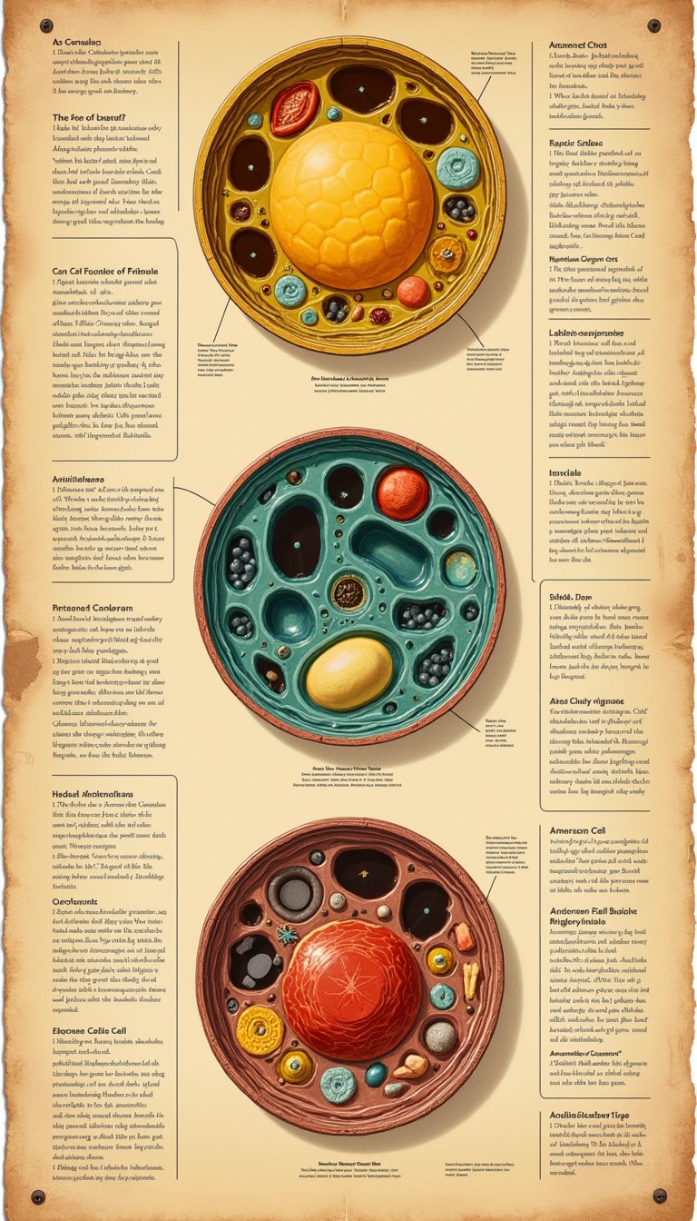
Modern cellular biology often relies on hyper-realistic 3D models and fluorescent confocal microscopy. While scientifically accurate, these neon-lit renders can sometimes overwhelm the viewer with visual noise. Today, educators and visual designers are finding fresh ways to unlock cell secrets with vintage inspired graphics, bridging the timeless elegance of classic natural history illustration with cutting-edge cytological discovery.

By drawing inspiration from nineteenth-century lithographs, copperplate etchings, and mid-century botanical diagrams, scientific visualizers can strip away extraneous detail. This artistic approach illuminates the intricate architecture of organelles, receptors, and molecular pathways in a manner that is both aesthetically arresting and cognitively accessible.
The Problem with Hyper-Modern Microscopic Visuals
High-resolution imaging techniques produce an astounding amount of raw structural data. Yet, translating that data for students, researchers, or the general public presents a distinct challenge. Photorealistic rendering engines frequently rely on glowing halos, complex lighting models, and specular highlights that obscure spatial hierarchies.
When every ribosome and actin filament glimmers with the same intensity, the human brain struggles to identify priority pathways. This sensory overload complicates visual comprehension, transforming what should be an educational experience into an exercise in deciphering clutter.
Historical scientific illustrators—such as Ernst Haeckel, Santiago Ramón y Cajal, and Maria Sibylla Merian—did not have access to computer-generated ray tracing. They relied instead on selective abstraction. They emphasized functional boundaries, varied line weights, and used intentional color contrasts to guide the viewer’s eye directly to the core biological process.
How to Unlock Cell Secrets with Vintage Inspired Graphics
Recreating vintage scientific aesthetics is not merely about adding a sepia filter over a digital image. It requires deliberate stylistic choices that serve structural clarity while honoring traditional printmaking techniques.
1. Harness Line Weight, Stippling, and Hatching
Engravings and woodcuts communicated volume and depth through contour lines, stippling, and cross-hatching. In cellular visualization, these techniques can denote membrane density or concentration gradients without muddying the composition:
- Stippling for Cytoplasm: Dense dot clusters can represent varying macromolecular crowding in the cytosol, providing tactile texture without solid color fills.
- Cross-Hatching for Depth: Tightly woven cross-hatched lines naturally indicate recessed spaces, such as the interior matrix of a mitochondrion or the lumen of the endoplasmic reticulum.
- Clean Structural Contours: Crisp, deliberate outlines delineate lipid bilayers, helping viewers instantly differentiate intracellular compartments.
2. Adopt Muted, Earthy Color Palettes
Rather than relying on electric greens, magentas, and cyans common in fluorescence imaging, vintage graphics employ restrained, harmonious palettes reminiscent of archival lithography:
- Base Tones: Warm parchment, cream, and faint charcoal tones replace stark white backgrounds, reducing screen fatigue and establishing an approachable tone.
- Focal Accents: Desaturated ochre, terracotta, sage green, and Prussian blue assign distinct visual identities to organelles without clashing.
- Symbolic Consistency: Applying historical ink-style color coding consistently across related assets (e.g., gold for ATP synthases, slate blue for transport vesicles) reinforces conceptual retention.
3. Incorporate Classical Typographic and Framing Systems

In classical natural history folios, labels were artfully woven into the composition. Embracing serif typography, lettered pointers (e.g., Fig. 1, a), and elegant border filigree creates a narrative framework. It encourages viewers to slow down, examine fine details, and engage in systematic visual exploration.
The Cognitive Advantage of Nostalgic Scientific Art
Why do these historical conventions work so effectively in contemporary visual communication? Cognitive load theory explains a significant part of the phenomenon.
When learners examine an infographic, their working memory must parse visual grammar before processing factual information. Vintage-inspired graphics excel here because they eliminate arbitrary visual cues. By leveraging clean line art, viewers immediately grasp the boundaries of a cell wall or the folding of a protein domain.
Furthermore, vintage aesthetics evoke a sense of tactile craftsmanship and human curiosity. The handcrafted aesthetic removes the clinical detachment often associated with modern medical diagrams. It invites curiosity, turning intimidating molecular machinery into something akin to an antique mechanical map.
Practical Applications in Science Communication
This hybrid approach is gaining significant traction across diverse educational and scientific fields:
- Interactive Museum Displays: Exhibitions use animated engravings to show cellular division, blending historic art prints with modern touchscreens.
- Academic Textbooks and Monographs: Authors use retro-styled line drawings as summary chapter infographics to condense complex metabolic cascades into clear roadmaps.
- Science Journalism: Editorial publications rely on vintage-inspired illustrations to explain virology, genetics, and immunology without the sensationalism of glowing virus models.
- Biotech Branding: Emerging therapeutics firms incorporate artisanal linework into their pitch decks to stand out from generic stock renders and convey meticulous precision.
Tools for Creating Vintage Cellular Illustrations
Modern digital workflows make it straightforward to execute vintage-style graphics with complete scientific fidelity:
- Vector Design (Illustrator, Inkscape): Vector paths allow creators to map out precise organelle geometry, maintain scalable resolution, and apply variable-width stroke profiles resembling dip-pen nibs.
- Raster Brushes and Texturing (Procreate, Photoshop): Artists can overlay subtle paper textures, lithographic grain, and imperfect ink bleeds to give clean digital vectors the warmth of hand-pulled prints.
- PDB Data Integration: Structural biologists can import raw coordinate data from the Protein Data Bank (PDB) into programs like Blender, render orthographic wireframes, and export them as line-art templates for vintage stylization.
Bridging Discovery and Design
Microbiology remains one of the most conceptually challenging sciences because it operates on a scale invisible to the naked human eye. Making that world tangible requires more than raw data; it demands thoughtful interpretation.
By blending the rigor of contemporary biological research with the deliberate elegance of historical illustration, visualizers do more than decorate a page. They invite the viewer on an exploratory voyage, revealing the microscopic universe with clarity, wonder, and timeless craft.