What Colors Don't Mix with Green?
Mastering Color Harmony 101: What Colors Don't Mix with Green

Green is one of the most versatile hues in nature, representing growth, renewal, and balance. Yet, when it comes to design, fashion, and visual arts, bringing this vibrant shade to life requires a solid grasp of color theory. While green pairs effortlessly with earthy neutrals and warm metallics, certain combinations can instantly make a space feel chaotic or an outfit look jarring. Mastering color harmony 101 means understanding not just what goes together, but actively knowing what colors don't mix with green.
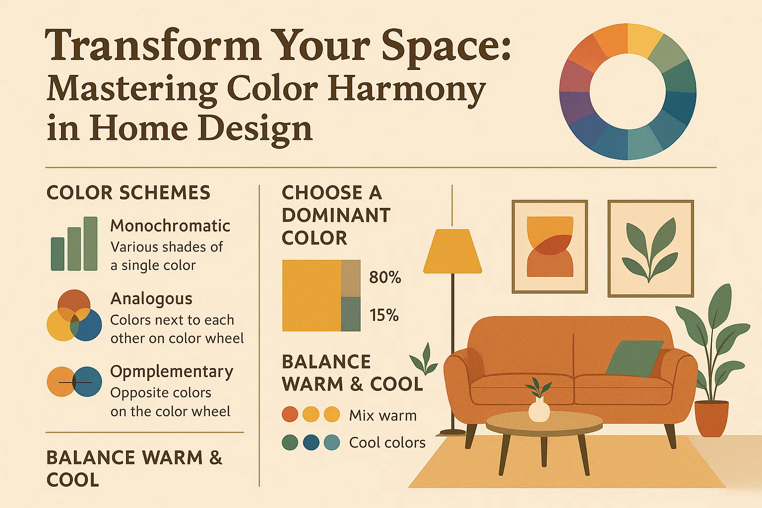
To avoid costly design mistakes and visual fatigue, you need to understand the underlying temperature, saturation, and undertones of green. Whether you are painting a living room, curating a capsule wardrobe, or working on a digital illustration, recognizing clashing color combinations is essential for creating polished, intentional results.
The Science of Color Discord
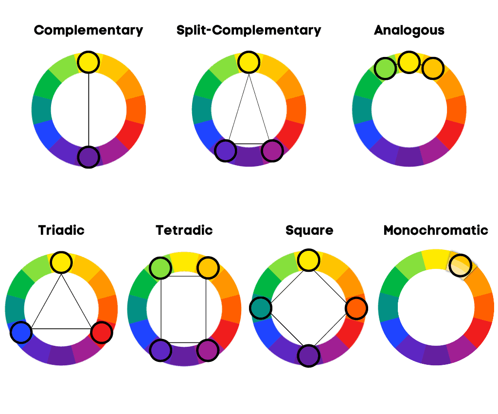
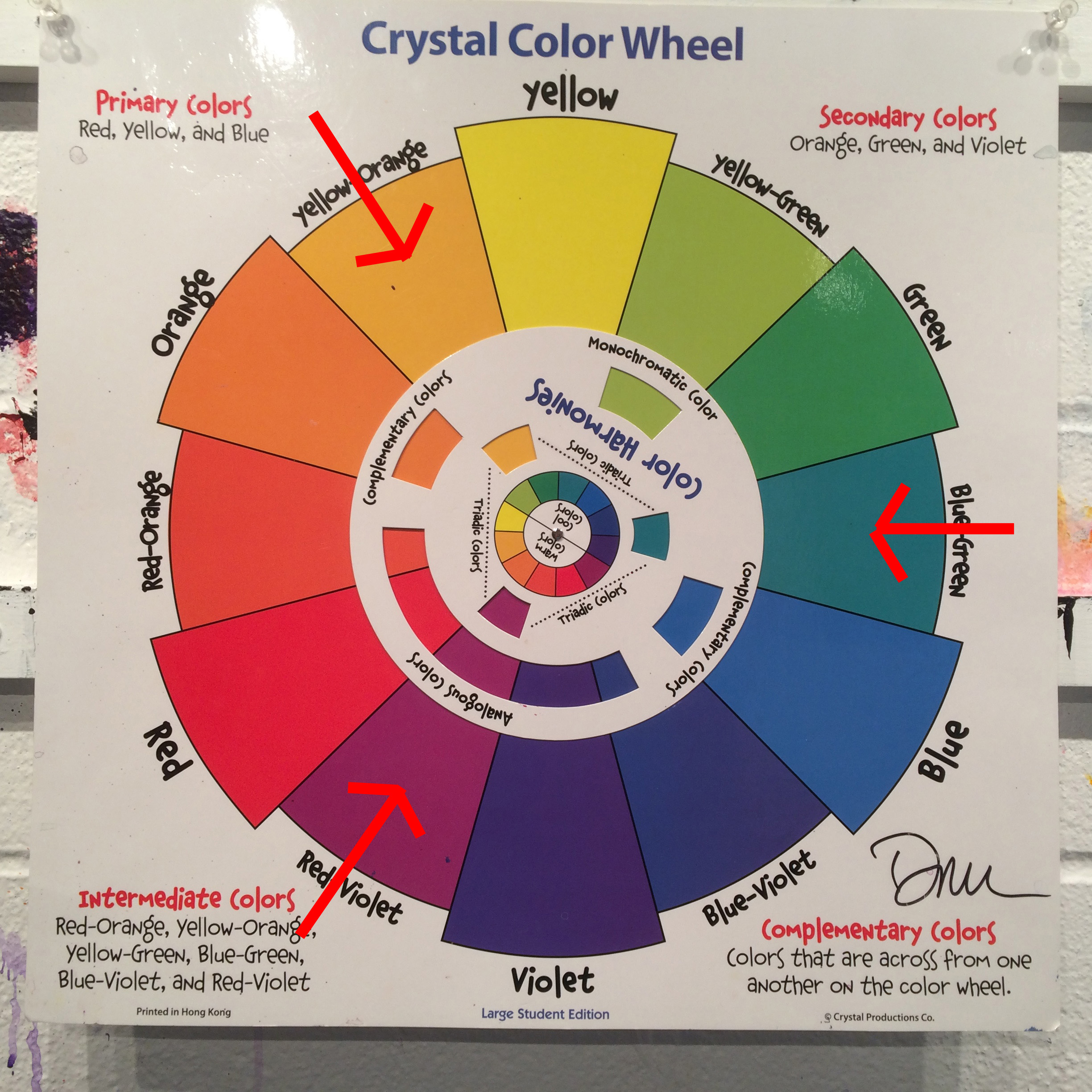
Before diving into specific clashing shades, it helps to understand why certain colors repel each other on the color wheel. Color harmony relies on relationships defined by color temperature (warm versus cool), saturation (vibrancy versus muting), and value (lightness versus darkness). When two intensely saturated hues compete for dominance without a neutral buffer, the human eye struggles to find a focal point, resulting in visual discord.
Green occupies a unique space because it sits directly between cool blues and warm yellows. Depending on its specific undertone—whether it leans toward a cool mint or a warm olive—its enemies on the color wheel will shift. However, a few universal culprits consistently create friction when paired incorrectly with green.
Colors That Clash with Green
1. High-Saturation Neon Red and Orange
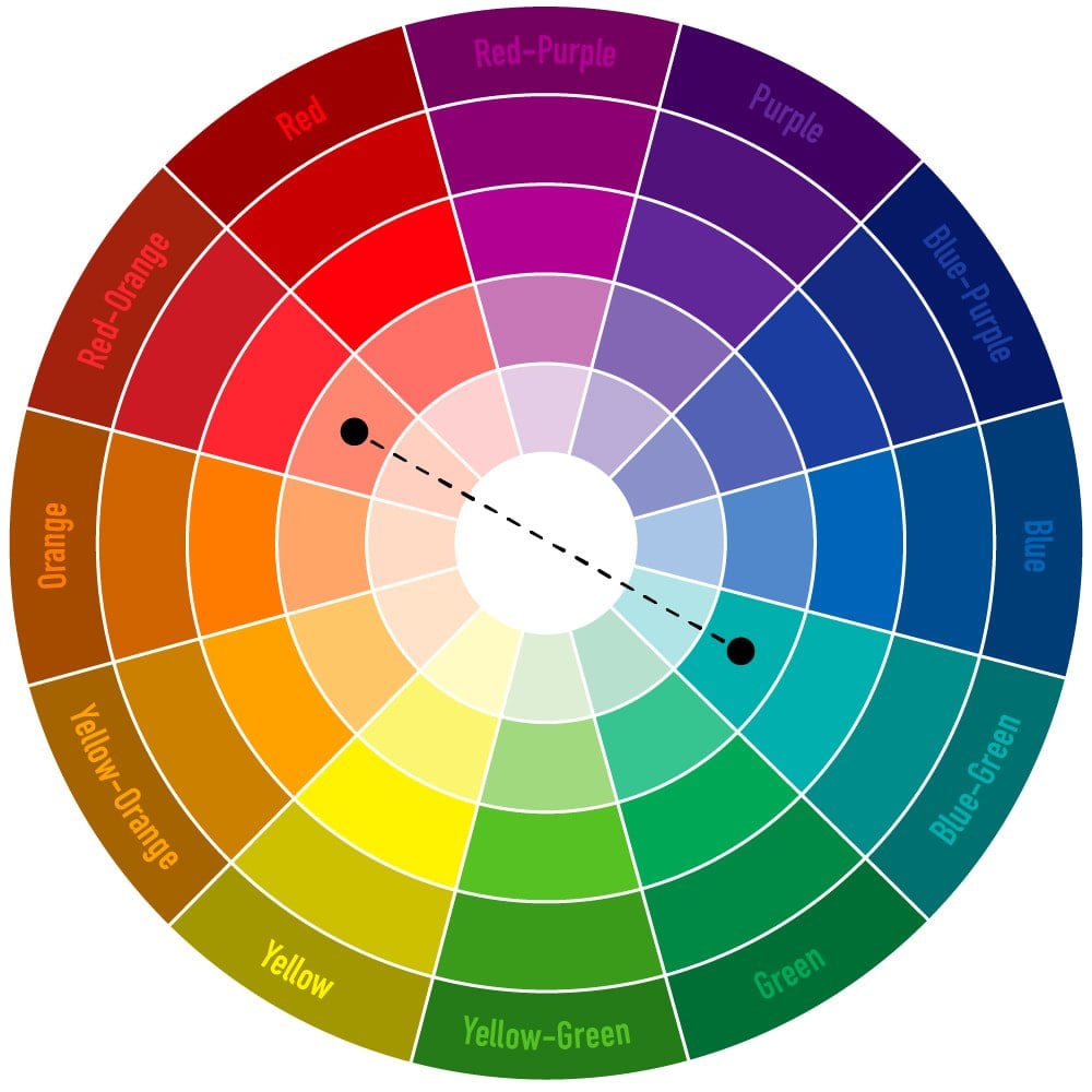
While red and green are technically complementary colors on the traditional RYB color wheel, context is everything. Pairing a vibrant, high-saturation grass green with an equally intense neon red or bright orange instantly triggers unwanted visual associations. Instead of sophisticated contrast, this combination screams December holidays or creates a jarring, headache-inducing vibration known as simultaneous contrast.
If you want to use red and green together, you must adjust the saturation and value. Swap the neon shades for deep burgundy paired with muted sage, or terra cotta paired with olive. This softens the intensity and creates a sophisticated palette rather than a visual assault.
2. Ice Blue and Teal
Video: COLOR THEORY BASICS: Use the Color Wheel & Color Harmonies to Choose Colors that Work Well Together
Green and blue can look stunning together when they share similar undertones, but pairing a warm, yellow-based green (like chartreuse or lime) with an icy, ultra-cool blue often results in a muddy, disconnected aesthetic. The cold temperature of ice blue drains the warmth out of lively greens, making the overall composition look washed out and uninviting.

Similarly, putting a vivid emerald green directly next to a dark teal can cause the two shades to visually swallow each other up. Because they sit right next to each other on the color wheel, lack of contrast in value makes the pairing look muddy rather than intentionally monochromatic.
3. Bright, Synthetic Magenta and Purple
While jewel-toned emerald and rich purple or magenta can evoke a regal, luxurious atmosphere, bright, synthetic purples and hot magentas often clash fiercely with yellow-greens and bright grass greens. Synthetic purples carry a heavy blue base that fights against the warmth of certain greens, creating an abrasive visual tension that feels restless and unbalanced.
To successfully pair purple with green, stick to deep, desaturated tones such as plum and moss, or let a neutral space bridge the gap between them.
4. Muddy Browns and Mustard Yellows (With Cool Greens)
Color temperature is the silent killer of good design. If you pair a cool, icy mint green or a stark blue-green with a warm, muddy brown or a heavy mustard yellow, the composition breaks down. The cool mint will look sickly and sterile against the rich, earthy warmth of the brown, while the brown will appear dirty rather than grounded.
Always match your temperatures: warm greens belong with warm earth tones, while cool greens thrive alongside crisp whites, grays, and cool blues.
Practical Applications: How to Fix Clashing Palettes
If you have already fallen in love with a shade of green that seems difficult to style, do not despair. You can neutralize potential clashes by implementing a few reliable design strategies:
- Introduce a Neutral Buffer: White, cream, beige, or charcoal gray acts as a visual palate cleanser, breaking up intense green combinations so they no longer compete for attention.
- Adjust the Saturation: If a color pairing feels too aggressive, mute one or both colors by adding gray or white to lower their intensity.
- Play with Value Contrasts: Ensure that one color is significantly lighter than the other. Pairing a very dark forest green with a pale, pastel pink creates instant depth and harmony.
Conclusion
Mastering color harmony is a journey of trial, observation, and understanding the subtle rules of the color wheel. By recognizing what colors don't mix with green—such as high-saturation neons, mismatched temperature blues, and abrasive purples—you can curate spaces, wardrobes, and artworks that feel balanced, intentional, and visually stunning.