Wheel of Fortune Game PPT: Design & Strategy Guide
Interactive presentations transform passive listeners into active participants. Whether you are hosting a classroom review, running a corporate training session, or spicing up a team-building event, a spin-to-win activity generates instant excitement. However, building an engaging presentation requires more than just dropping a graphic onto a slide. To make your session run smoothly, you need to avoid common mistakes with proven Wheel of Fortune game PPT template design strategies that ensure both visual appeal and flawless technical execution.

Understanding the Appeal of Gamified Presentations
Gamification taps into our natural desire for competition, surprise, and reward. When presenters use a digital wheel, audiences lean in. Anticipation builds with every click, keeping attention levels exceptionally high compared to traditional slide decks. Yet, poorly designed templates often ruin the experience through clunky animations, confusing navigation, or broken hyperlinks.
Creating a seamless experience means balancing aesthetics with usability. Your audience should focus on the game, not on trying to figure out why the wheel isn't spinning or why the text is unreadable.
Top Mistakes to Avoid in Wheel PPT Design
Before diving into best practices, it helps to identify what goes wrong in most amateur presentations. Avoiding these pitfalls will immediately elevate the quality of your project.
Overcomplicating Visuals and Color Choices
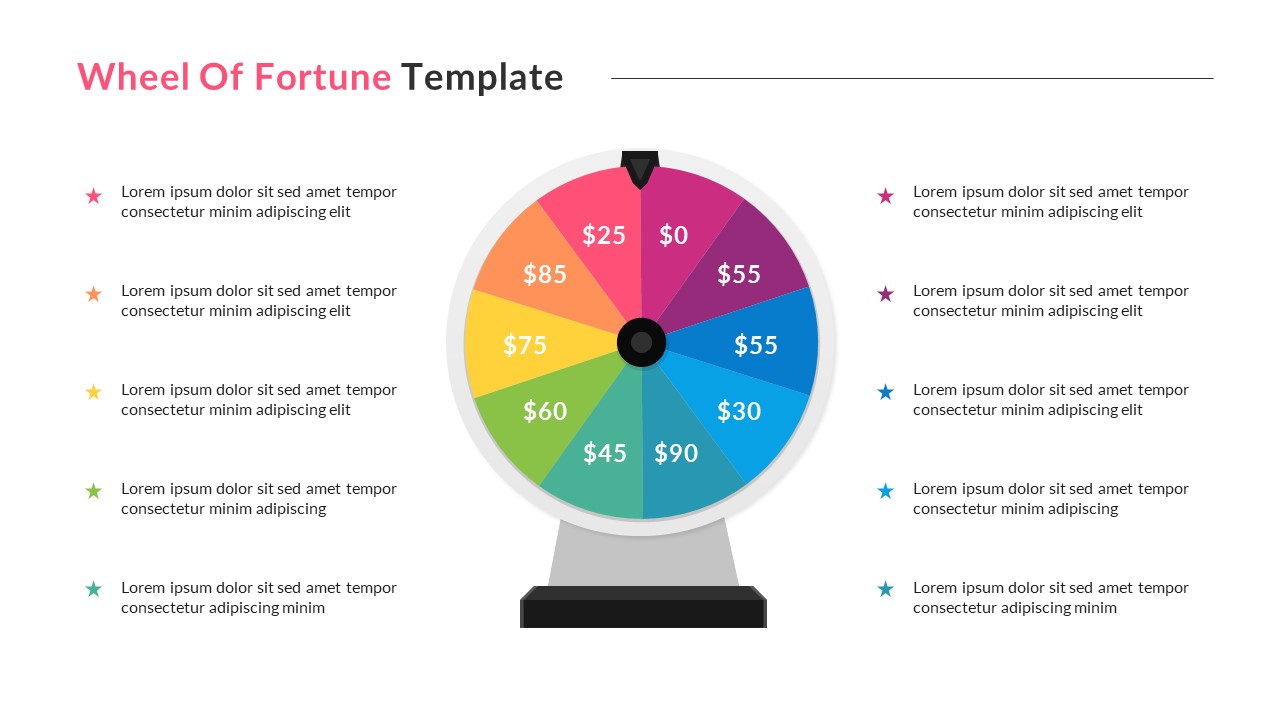
A wheel with twelve different neon colors, drop shadows, and complex gradients quickly becomes an eyesore. When too many visual elements compete for attention, the slide looks cluttered and unprofessional. Stick to a cohesive color palette that aligns with your brand or event theme, limiting the wheel segments to 6 or 8 distinct, high-contrast colors.
Ignoring Mobile and Projector Contrast
What looks vibrant on your laptop screen might wash out under a bright office projector or appear tiny on a mobile device. Always test your slides in the actual presentation environment to ensure text inside the wheel segments remains legible from the back of the room.
Relying on Broken Triggers and Complex Macros
Many creators attempt to build complex VBA macros to spin PowerPoint wheels randomly. While impressive when they work, these macros often fail due to security settings on corporate laptops. Stick to native animation triggers and simple hyperlinks to guarantee reliability across different computers.
Video: Build Your Own Wheel of Fortune Game in PowerPoint | Step by Step Tutorial

Proven Wheel of Fortune Game PPT Template Design Strategies
To build a robust, foolproof, and engaging game, implement these fundamental design and structural strategies:
1. Prioritize Simplicity in Navigation
Keep your user interface intuitive. The presenter or player should only need to click the wheel itself to trigger the spin, and click a designated button to reveal the question or prize. Avoid burying navigation controls in hidden corners of the slide.
- Use a clear, centered "Spin" button or make the wheel graphic the primary trigger.
- Include a dedicated "Return to Wheel" button on every question slide.
- Test the full loop—spin, land, question, answer, and return—multiple times before the live event.
2. Optimize Typography and Segment Labeling
Fitting text inside wedge shapes is notoriously difficult. If your labels are too long, they overlap or become microscopic.
- Keep wedge text short (e.g., "50 Points", "Bonus", "Lose a Turn").
- Use bold, sans-serif fonts like Arial, Montserrat, or Helvetica for maximum legibility at a distance.
- Rotate text to follow the angle of the wedge if necessary, or place numbers/icons on the wheel and keep the corresponding rules on a separate scoreboard.
3. Leverage Native PowerPoint Animations Wisely
PowerPoint offers built-in spin entrance and emphasis effects. To make your wheel look authentic:
- Apply a "Spin" emphasis effect to the wheel graphic.
- Adjust the duration to match the suspense—between 2 to 4 seconds works best.
- Pair the visual spin with a clean, static pointer fixed at the top or side of the wheel so players know where the winning slice lands.
Enhancing Engagement Beyond the Spin
A great template is only half the battle; how you facilitate the game matters just as much. Keep the energy high by establishing clear rules before starting. If you are using the game for educational quizzes, have backup questions ready in case you land on the same wedge repeatedly. Furthermore, incorporate sound effects if your venue allows; a subtle click or chime during the spin dramatically boosts immersion.
Conclusion
Designing an interactive presentation does not require advanced coding skills. By steering clear of visual clutter, relying on native PowerPoint triggers, and focusing on clear typography, you can deliver an unforgettable experience. Apply these strategic principles to your next project, and watch your audience engage like never before.